Enabling students to find an English course that fits their goals
Students at Spring Learning struggled to understand the English language course offering. All age groups, from toddlers to adults, appeared on a single page. There was little context for the courses, which made choosing difficult. I redesigned the discovery experience with dedicated course pages and clearer navigation. I also created a component system for the team to use.
The redesign launched alongside other growth efforts. When we compared similar six-month periods, we saw improvements in key metrics:
- A 58% increase in visitors
- Visitors spent almost double the time exploring the site
- They viewed 22% more pages
Project overview
- Client: Spring Learning
- Timeline: 2022
- Role: UX/UI Designer
- Type: UI/UX, Wordpress, education
- Tools: WordPress, Elementor Pro
- Status: This design stayed in use through 2024, when new owners acquired the business and moved it to a new platform.
Background
Spring Learning is an English language school in Japan. They offer courses for different ages and skill levels. Students struggled to find the right course, and staff also found it hard to keep information up to date. I set out to redesign course discovery and improve information structure. The aim was to make it easier for students and parents to find the right course. On top of that, I wanted to create a system that staff could maintain on their own.
Challenge
Students and parents faced two main barriers when trying to find the right course.
All courses on one long page
Parents of toddlers, elementary students, and adults all landed on the same page. They had to scroll through multiple sections to find their age group.
Not enough detail to decide
Course descriptions lacked important details like curriculum, teacher background, and learning outcomes. Parents often had to contact the school to get basic information.
In addition, staff found it hard to keep information up to date across the site. Any solution needed to be easy to maintain for a non-technical team.
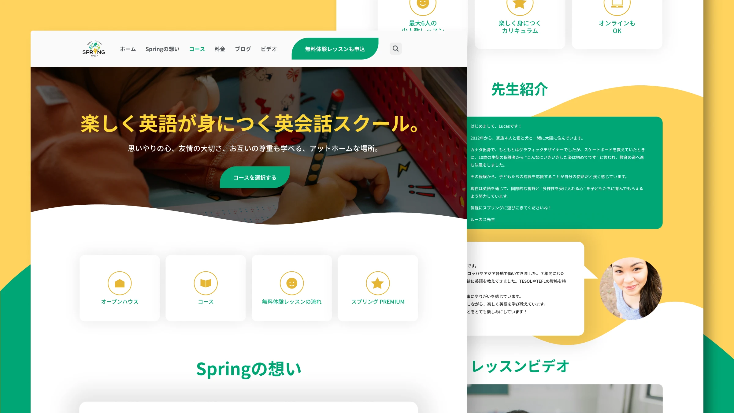
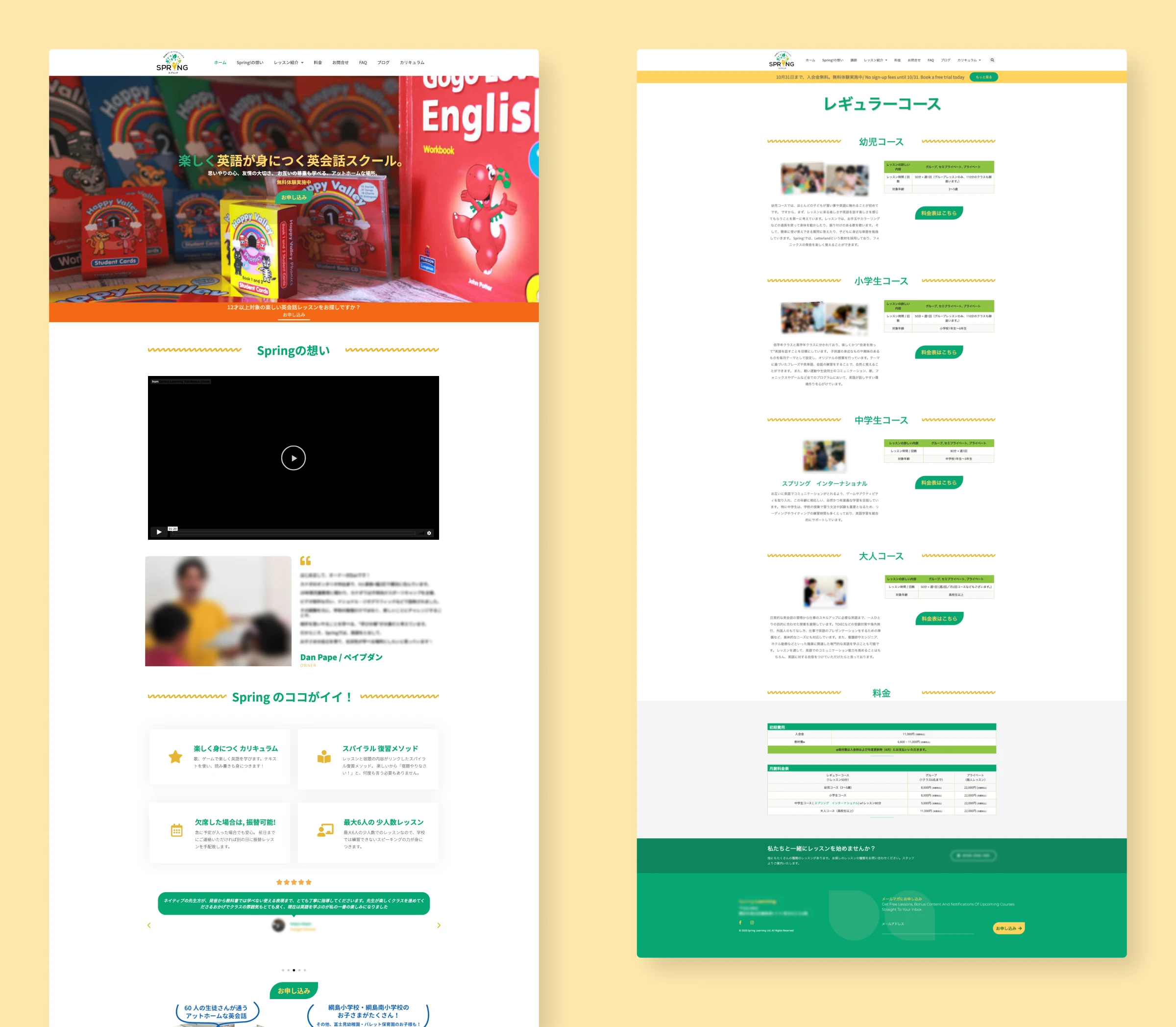
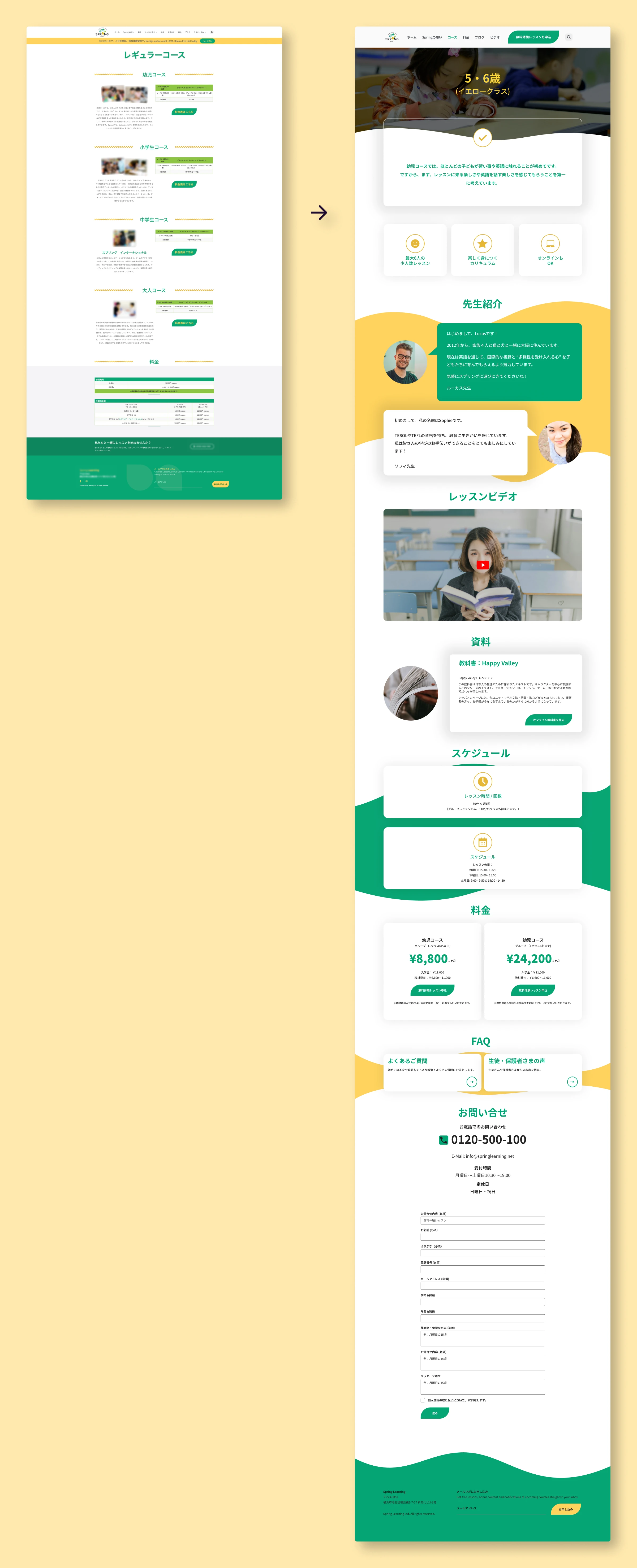
What the old site looked like
All courses were on a single page organized by age group. While the layout was clean, it still required scrolling to find the right course, and course details were brief. Parents couldn't find information about curriculum, teacher qualifications, or learning outcomes without contacting the school.
What I did
I led the UX and UI redesign to make it easier for students and parents to discover and choose courses:
- Developed dedicated course pages organized by age and skill level to streamline discovery and provide detailed information
- Created scalable and accessible templates that enable staff to maintain consistency across the site and easily update course information without technical support
- Improved accessibility features to support all learners, ensuring inclusivity
I worked with the Spring Learning team to understand their needs and to confirm our design choices. The main goal was to make it easier for students and parents to find the right classes and information. We also wanted to help staff make simple updates to keep the content current. This approach focuses on helping users find what they need, while supporting the business goals of growth and conversion.
Deciding content priorities, organization and structure
Collaborated with staff to understand student needs
The team knew parents needed more details on the site, but didn't have all the answers on what to focus on. We worked together to figure out what information mattered most. We landed on information about curriculum, teacher, learning outcomes and trial lessons. I used quick wireframes to make sure we all agreed on the direction. This also worked to avoid misunderstandings before moving to the implementation phase.
Looked at what competitors were doing
I reviewed other Japanese English schools to see how they organized courses. The majority used age and level groupings with dedicated course pages. Parents would already be familiar with this layout, so using the same setup made sense. Using the same patterns let visitors focus on courses instead of how to navigate the site.
| Feature | AEON | Nico Kids | ECC Kids | What I chose |
|---|---|---|---|---|
| Course segmentation Other English language schools, course segmentation | By age & level | By age, level & purpose | By age, level & purpose | Age-based structure Choice: Age-based structure |
| Course highlights Other English language schools, course highlights | "Point 1/2/3" format | "Point 1/2/3" format | "Point 1/2/3" format | Used a version of this "Point 1/2/3" format Choice: Used a version of this "Point 1/2/3" format |
| Course presentation Other English language schools, course presentation | Separate pages per course | One page for all course options One page, all options | Separate pages per course | Dedicated course pages Choice: Dedicated course pages |
One page per course, not one page for all
I thought about putting all courses on one comparison page, with improved information. But we decided dedicated pages made more sense. Each course could have more detail, and the site would be easier to grow. The team could then add new courses to the directory, using available templates.
Single comparison page
Benefits
- See all courses at once
- Less clicking
Drawbacks
- Too much information at once
- Harder to make each course stand out
- Difficult to tailor messaging for different age groups
- Can't share link to specific course
Dedicated course pages
Benefits
- One course, one focus
- Easy to share links
- Space to highlight what makes each course different
Drawbacks
- Need more tabs or clicks to compare
- Keeping pages visually consistent
- More pages to maintain
In short, dedicated pages let us give each course the attention it deserved. They meet the goals of helping students find the right course through improved information and organization.
Solution
Clear organization by age and level
We grouped courses so students and parents can find what they need right away. The homepage links directly to the course directory, so visitors don't have to search.
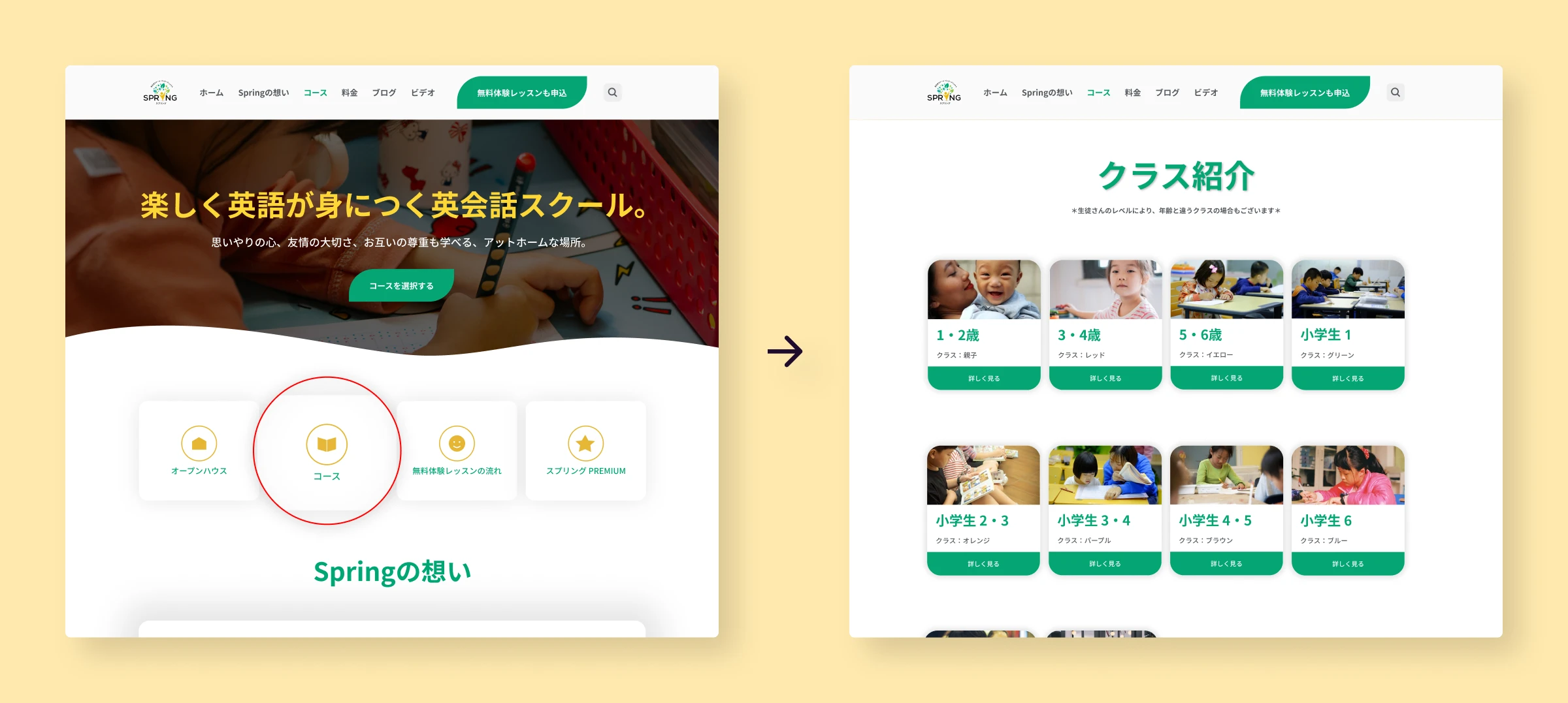
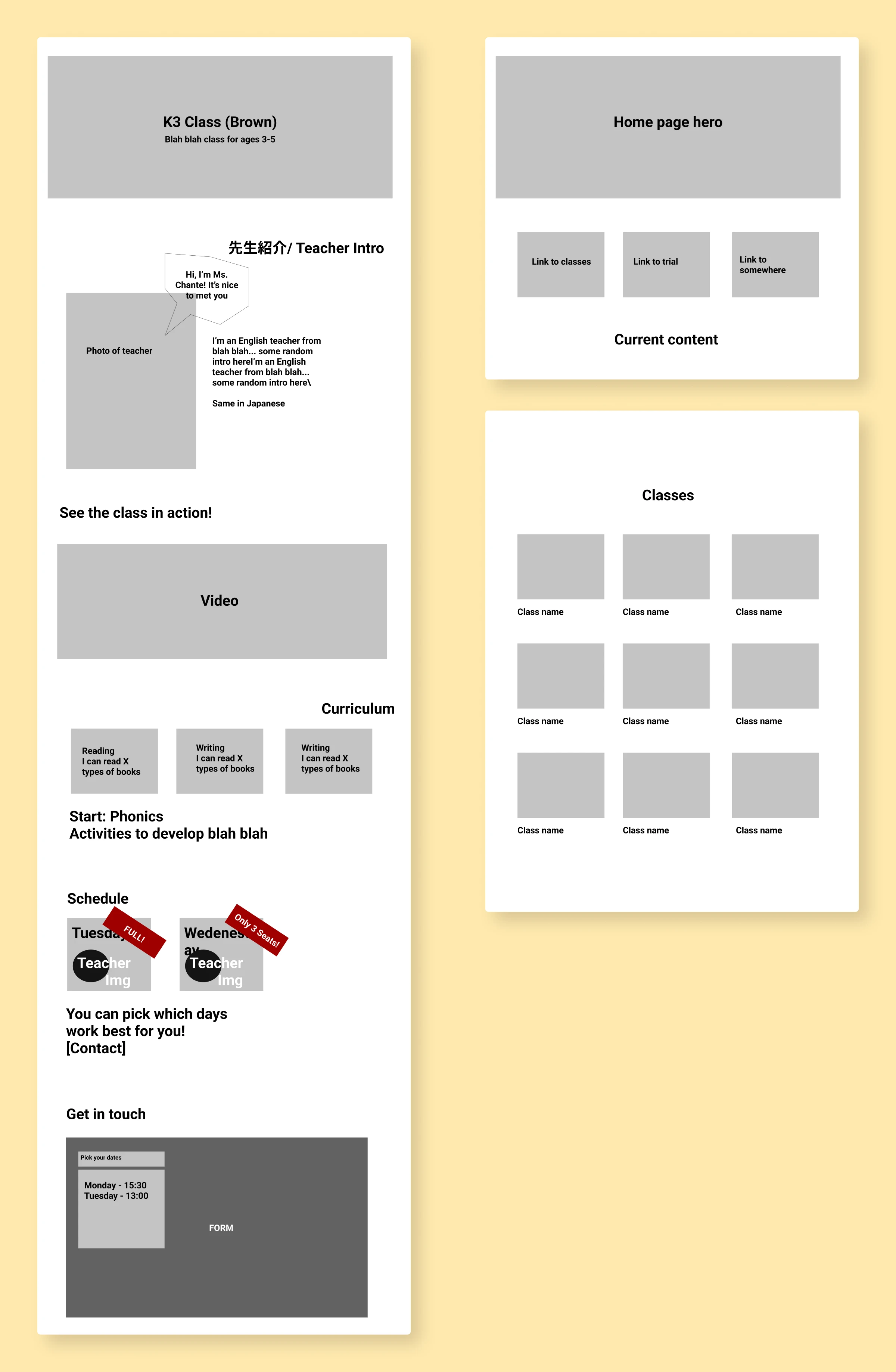
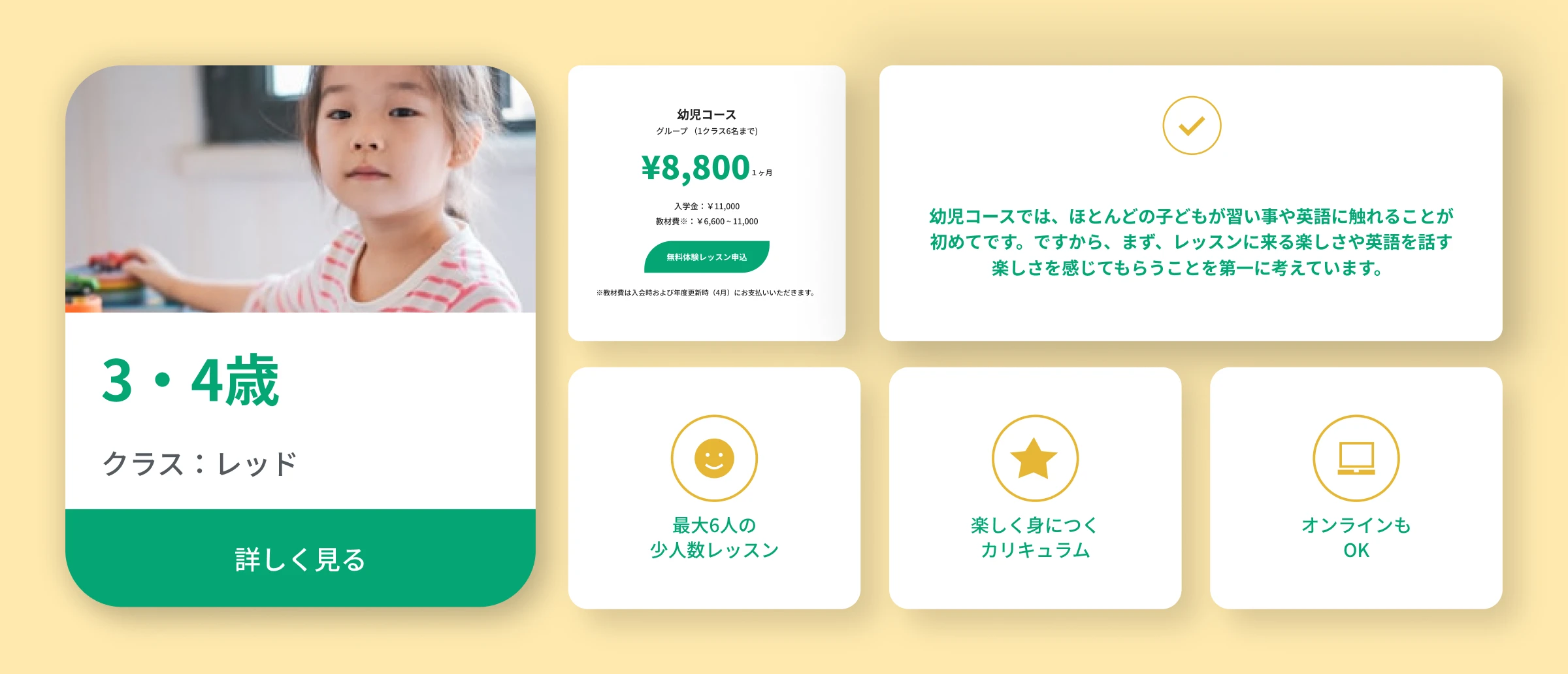
Each course has a dedicated page
Every course page follows the same layout, with variations depending on age group and available content types. There are sections for goals, teacher, curriculum, schedule, and pricing. This keeps things focused. Students and parents see what they need without getting distracted. Each page highlights what makes that course special, and the messaging fits the age group.
Before: All courses listed on a single page with minimal details.
After: Dedicated pages for each course, with focused content.
Templates that staff can maintain
I built reusable templates in Elementor. I added course cards, curriculum sections, teacher bio and buttons as reusable components. This lets staff update and add new content on their own without needing design or developer help.
Made it accessible
I improved button contrast from 2.19:1 to 13.12:1, which exceeds WCAG accessibility standards. I also refined typography, spacing and visual hierarchy to make the site easier to use for everyone.
What changed
The redesign improved how visitors explored courses and helped the business grow. The improvements happened at the same time as other initiatives, so the metrics are influenced both by the redesign and other growth efforts. Comparing two six-month periods showed:
58% more visitors exploring courses
44% longer time spent on the site
22% more pages viewed per visit
Students could now find courses and make confident decisions based on detailed information. The template system helped staff handle website tasks. They could update courses, launch new programs and maintain a blog on their own. All while keeping the design consistent.
What I learned
- Plan the content organisation and navigation early: Setting up the structure at the start made it easier to make design decisions.
- Keep the people maintaining it in mind: Creating templates for staff to use meant balancing flexibility with structure. Too much freedom and the site gets messy. Too little and they feel stuck. It was an interesting challenge to consider what templates and guidelines to create for staff.
- Local conventions matter: Understanding patterns from other local language schools meant visitors could navigate using familiar patterns. The research into this was helpful to understand how languages schools in Japan present information. For example the clear "Point 1/2/3" format for course highlights was a common pattern that I adapted for this site.
- Accessibility can mean tradeoffs: Spring Learning has a specific brand and color palette. Improving accessibility meant discussing tradeoffs with the team. In particular it meant balancing user needs, standards and the branding.
Impact over time
The redesign launched in 2022 and grew with the business. I continued supporting the site through 2024, including:
- Adding new courses and updating content
- Monitoring analytics to spot problems
- Optimizing for mobile as more visitors used phones
- Scaling the template system as the program grew
In particular the analytics monitoring was key to understand the effect of the redesign and plan future improvements.
Spring Learning on working with Lizzie
Lizzie was an absolutely fundamental part of our team when it came to UX design, web development and branding. Every time we needed her expertise, she delivered with unmatched skill, professionalism, and creativity as a full-stack designer.
Her ability to take even the most complex vision and break it down into an understandable and actionable project was nothing short of remarkable. She communicated exceptionally well throughout every stage of the process, ensuring that everyone was on the same page and that the final result exceeded expectations.
Whether it was creating a stunning logo or developing a sleek, functional website, Lizzie consistently turned ideas into reality with precision and creativity in a way that delivered tangible business results-she was also involved in monitoring site performance, analyzing user data, and optimizing designs to increase conversions. She wasn't just a designer-she was a true collaborator and problem solver. We were incredibly grateful to have had her as part of our team and cannot recommend her highly enough!
Other work
Dr. K Psychology: Helping visitors figure out if this is the right fit
I redesigned this psychologist's website as a one-page site with straightforward navigation and clear contact information, so visitors could see if it was a good fit and get in touch easily.
View case study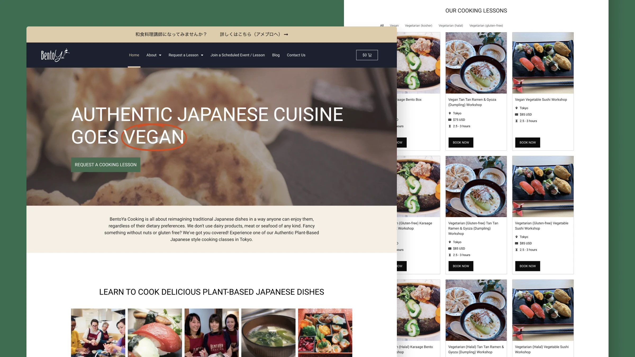
Bentoya Cooking: Helping Japanese food lovers choose the right cooking class
Redesigned the booking experience for a Japanese cooking school, creating a clearer flow from discovery to enrollment with improved mobile experience and streamlined admin tools.
View case study