Helping Japanese food lovers choose the right cooking class
Visitors couldn't easily find the right cooking class. Dietary options existed, but they weren't immediately clear. This created uncertainty and extra work for the team. I restructured the site to highlight classes and dietary options early on, so visitors could quickly see which classes fit their needs.
Post-launch results:
- Class directory visits doubled (4% → 8%)
- Time spent on the site increased by over 50%
- About 5% of visitors now go straight from the homepage to a specific class
Project overview
- Client: Bentoya Cooking
- Web: bentoyacooking.com
- Timeline: 2023
- Role: UX/UI Designer
- Type: UI/UX, information architecture
- Tools: WordPress, Elementor Pro, WooCommerce
Background
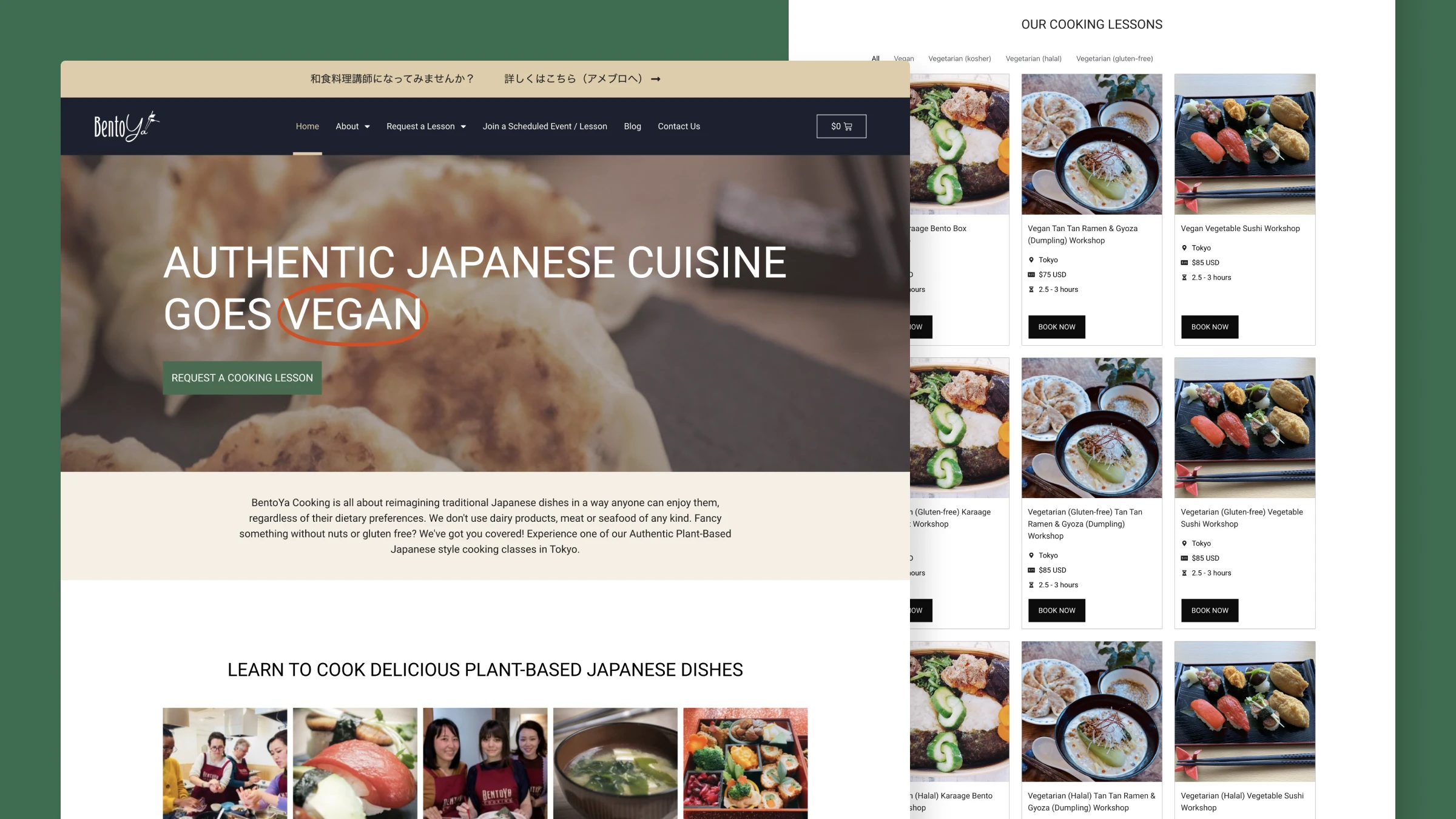
Bentoya Cooking offers Japanese cooking classes. They provide vegan, vegetarian, halal, and kosher options for international visitors in Tokyo. These options were available, but not clearly visible on the homepage.
I had previously supported Bentoya Cooking with technical maintenance and WooCommerce setup. The goal of this project was to help visitors find classes matching their dietary needs.
Challenge: The discovery problem
The site's structure made it hard for visitors to discover classes. Three problems stood out from analytics and staff feedback:
Classes were hard to find
Only 4% of visitors reached the class pages. This meant the majority of visitors never saw the classes themselves, which is a clear issue for a site built around classes.
Dietary information didn't help
Dietary labels existed, but they weren't clearly visible or filterable. Visitors would browse, feel unsure, and email staff. This created friction in the booking process.
Key details weren't scanned easily
Important details like duration, location, price, and dietary options weren’t grouped or laid out in a scannable way. This made it harder for visitors to compare and decide.
What I did
I led the UX and UI redesign with a focus on class discovery for international visitors:
- Restructured the homepage to show class options immediately
- Implemented dietary filtering using category-based navigation
- Built scalable, maintainable components within WordPress/Elementor
- Improved typography, contrast and hierarchy for better accessibility
I worked with the Bentoya team to understand their needs and constraints, and to validate design decisions. This was a collaborative process that balanced user needs with business goals.
We chose this structure because it helps visitors quickly spot options that fit their dietary needs, while supporting the business goal of getting more people to relevant classes. The redesign makes it easier for visitors to find and request classes that suit their needs, which is a win for both users and the business.
Working with available information
Started with staff input and analytics
There was no budget for formal user research, so I leaned on three sources: Google Analytics, staff observations and the existing information architecture.
Conversations with staff made it clear that dietary options needed to be easier to understand. Visitors were often unsure and reached out for clarification. Paired with the low class page visit rate, it was clear that discovery was a real barrier in the user journey.
Studied how other platforms solve discovery
I looked at sites like Cookly, airKitchen and Veecoco to understand how people expect to browse cooking classes. I focused on patterns for discovery and how information is presented, so the experience would feel familiar and intuitive.
Common patterns included:
- Featured classes on the homepage
- Clear category filters
- Left-aligned text and consistent hierarchy
- Visible pricing without extra clicks
| Feature | Cookly | Veecoco | airKitchen | What I chose |
|---|---|---|---|---|
| Homepage class display Other cooking class providers, homepage class display | Featured classes | Categories display | Featured classes | Featured classes on homepage Choice: featured classes |
| Category display Other cooking class providers, category display | Yes | Yes | Yes | Dietary labels as base for categorization Choice: Dietary labels as base |
| Dietary filters Other cooking class providers, dietary filters | Location-based search | Vegan focus | No built-in filters | Dietary category filters Choice: dietary filters |
| Content hierarchy | Other cooking class providers, content hierarchyRight-side booking column, segmentation via headings/borders, left-aligned Booking column, headings/borders, left-aligned | Pricing card + imagery | Price in fixed bottom bar, left-alignment Fixed bottom bar, left-alignment | Right-side booking, clearer headings/borders, left-alignment Choice: Right-side booking, clear headings, left-alignment |
Validated designs with the team
I ran two focused feedback rounds with the Bentoya team. Each round, they reviewed the designs and shared feedback on clarity, structure, and business needs. This wasn’t formal usability testing, but it was grounded in their day‑to‑day contact with customers.
Most of the feedback was about copy clarity and pricing transparency. These cycles helped shape a solution that worked for both visitors and the business.
Cycle 1
Draft v1 → Staff review → Changes made
Focus areas: Clarity, structure, descriptions
Cycle 2
Draft v2 → Staff review → Final
Focus areas: Pricing, polish, final alignment
Solution
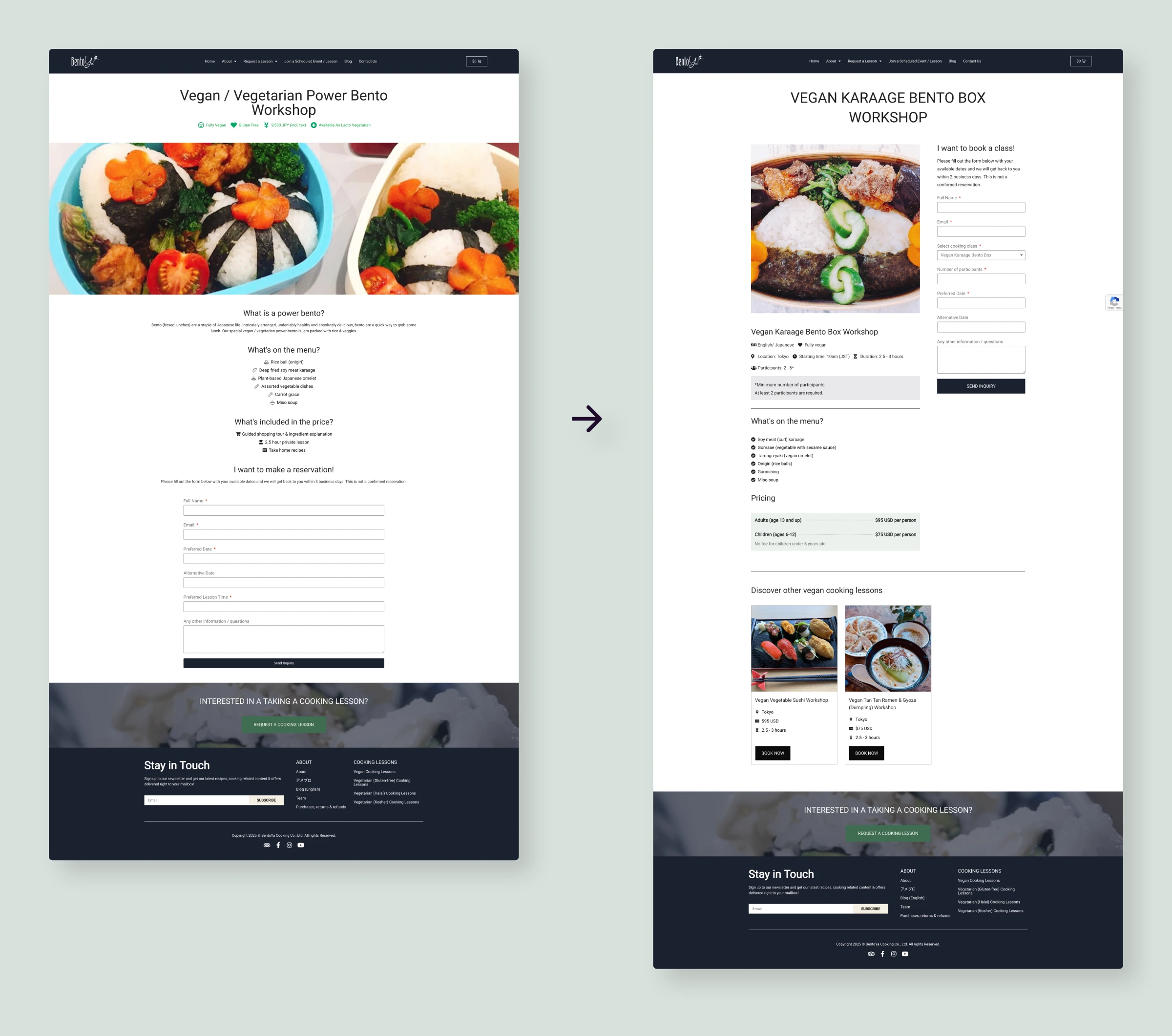
Classes are visible from the homepage
The new homepage brings classes and key details to the forefront, so visitors can understand what's on offer more quickly. Clear filtering supports this by helping them narrow down to relevant classes.
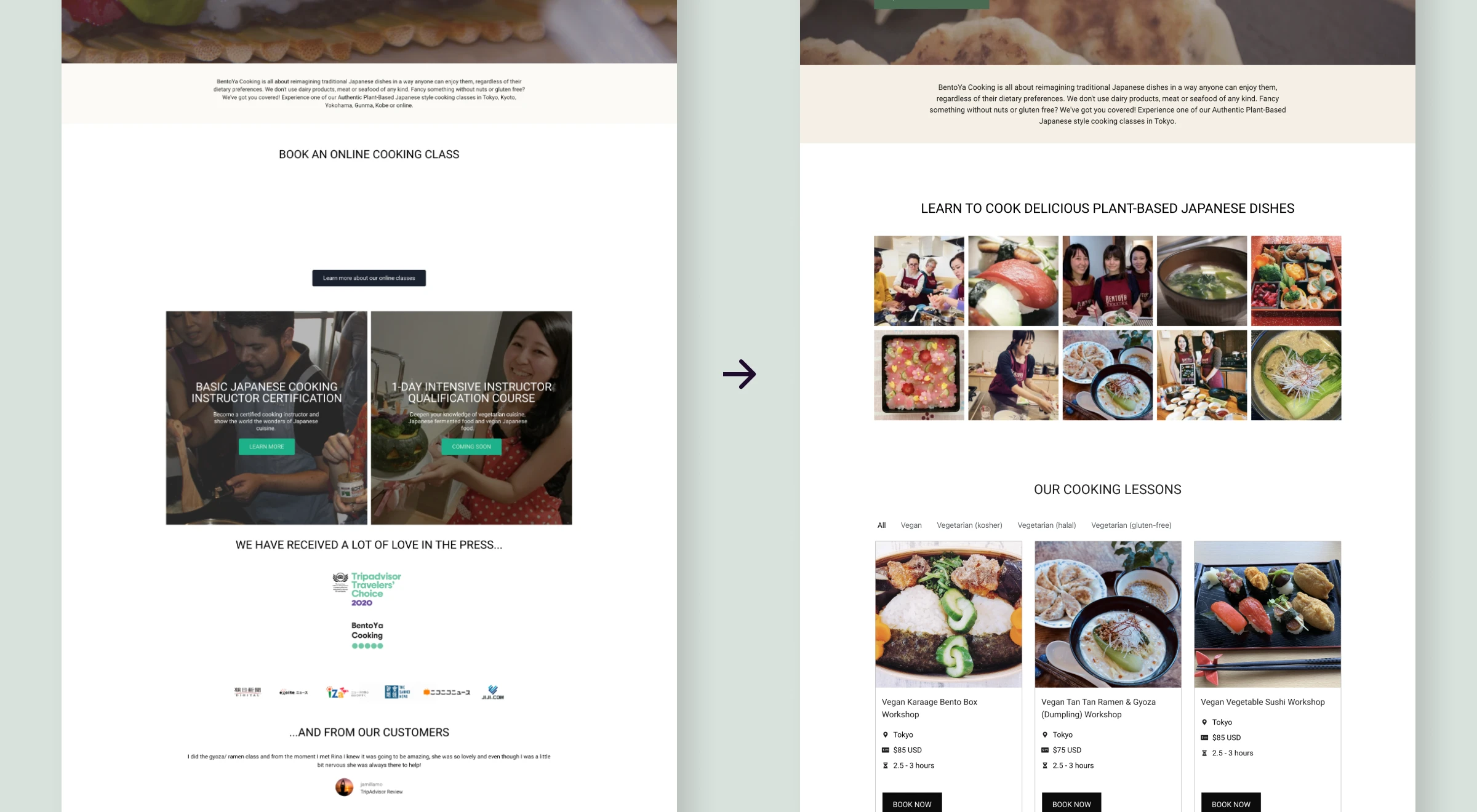
Dietary filters make options immediately actionable
Visitors can choose dietary categories (vegan, vegetarian, kosher, halal and gluten-free) and see matching classes instantly. This removes the back-and-forth where people had to email staff to ask if a class suited their needs.
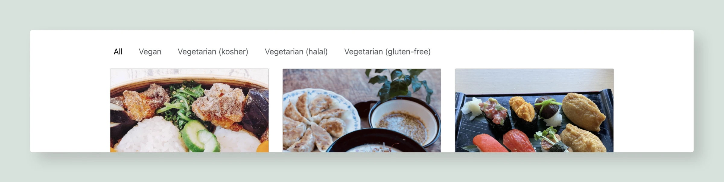
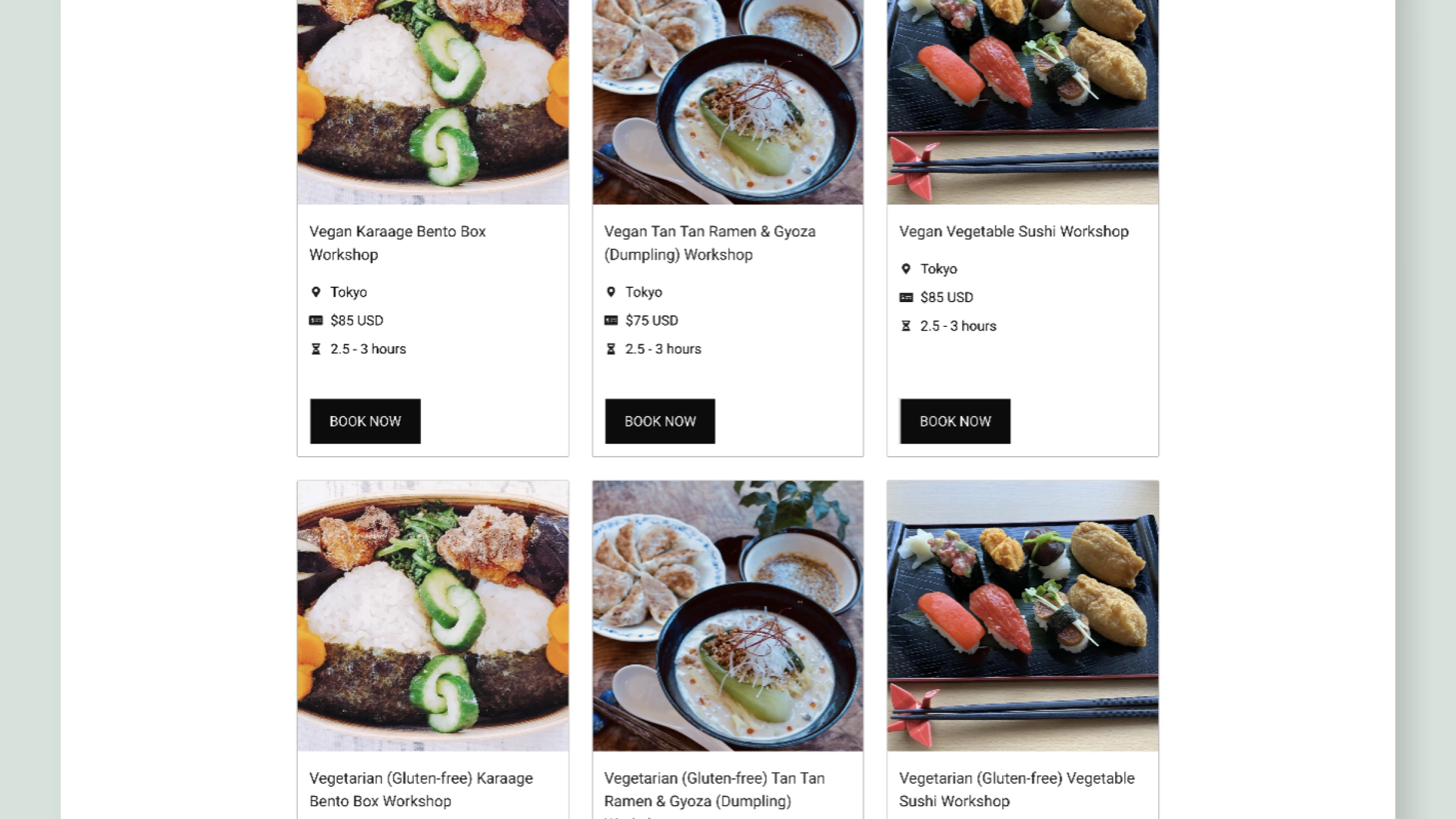
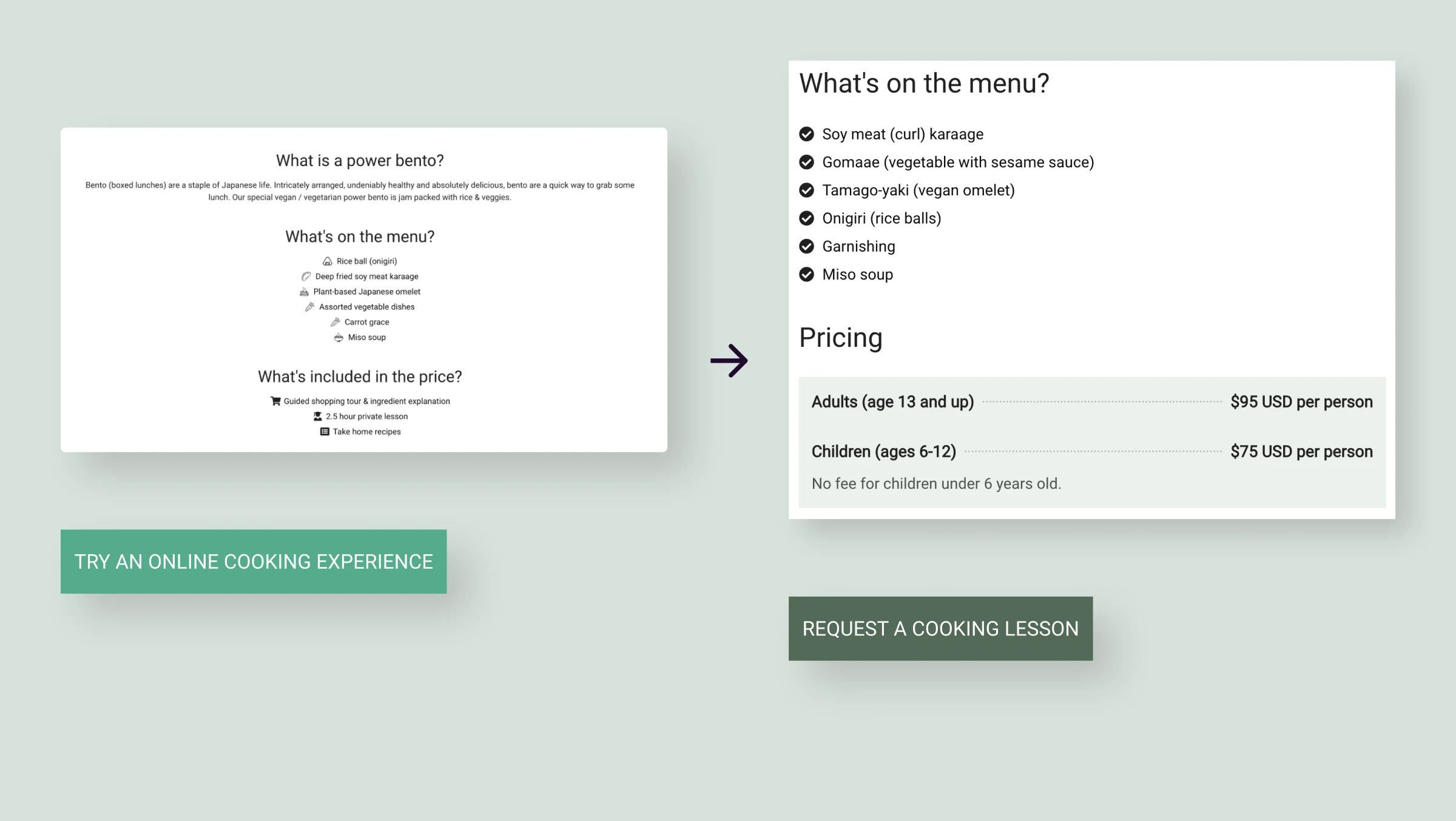
Class cards present essential information at a glance
Each class card shows the name, duration, location, price, and a clear “Book now” button. This lets visitors decide quickly if the class is right for them.
The cards are built with reusable components and custom fields. This makes them easy to update and keeps the system maintainable within WordPress and Elementor.
Class pages were restructured for clarity and action
The class detail pages were reorganized with:
- The booking form moved higher on the page, reducing scrolling
- Left-aligned, structured content for faster scanning
- Pricing shown clearly and in context
- Information arranged in a logical flow that leads toward booking
Accessibility improvements support readability
Color contrast was improved from 2.77:1 to 6.04:1 to meet WCAG AA. I also adjusted text alignment, heading hierarchy, and spacing. These changes make the site easier to read and more comfortable to use.
What changed: Measurable outcomes
In the months after launch, analytics showed clear changes in behavior:
Doubled class directory
visits
(4% → 8%)
+50% more time spent on the
site
~5% now navigate directly
from homepage to specific classes
The 100% lift in visits to class detail pages is a positive sign that the redesign is helping visitors find relevant classes more easily.
The increase in time spent on the site suggests that visitors are engaging more deeply with the content. This could indicate they're exploring class options more thoroughly. The fact that around 5% of visitors now go straight from the homepage to specific classes shows that the new structure is making it easier for users to identify and navigate to classes that fit their needs, which is a key goal of the redesign.
Overall, these metrics suggest that the changes are having a meaningful impact on how visitors interact with the site and are likely contributing to better discovery of classes.
What I learned
- Work strategically with the information you have: Without formal user research, I relied on staff insight, analytics, and competitor patterns. This forced me to be clear about what I could actually validate and where I was making informed assumptions. It also made me more resourceful, which is often necessary in real-world constraints.
- Visibility compounds across small changes: The homepage redesign, filters, typography, and accessibility improvements all tackled the same core problem from different angles. None of these changes were massive on their own, but together they moved key metrics in the right direction.
- Experimenting beyond the page builder can lead to better solutions: Elementor on its own couldn't support the level of filtering and structured content we needed, so I explored the ACF plugin for WordPress and learned how to combine it with the existing setup. That willingness to test new tools and patterns made it possible to build flexible filters and reusable class cards without resorting to a full custom build. It reinforced for me that pushing slightly beyond my usual toolkit often unlocks cleaner, longer-lasting solutions.
- Ongoing involvement shows what really works: I've continued to support Bentoya's platform through WordPress admin, WooCommerce updates, and content maintenance. Seeing how the site performs over time has shown me which design decisions hold up and which need to be refined. That ongoing feedback loop has reinforced the value of planning for maintainability from the start and building a simple design system of reusable components. Having that system in place makes it much easier to scale the site, add new classes, and iterate on what already works instead of rebuilding from scratch.
Sustaining the design
Before and after this project, I've helped maintain Bentoya's platform through:
- WordPress administration and plugin management
- WooCommerce product updates (new classes, pricing changes)
- Content updates (seasonal updates, information accuracy)
- Performance monitoring
Staying involved with the live site keeps me close to how the design actually behaves in the real world. This gives me a sense of how it performs and where there are opportunities to iterate and improve. This also feeds into how I approach future projects.
One area where I see potential for future improvements is page loading time. Improvements in this area could further improve user engagement and conversion rates.
Bentoya Cooking on working with Lizzie
It's been an absolute pleasure working with Lizzie over the past six years. She's been incredibly reliable, thoughtful, and always approaches her work with genuine care and positive energy.
Lizzie has continuously refined and elevated our website, making it more reliable, accessible, and easy for users to explore our classes. Her creativity, attention to detail, and clear communication have had a lasting impact on our business growth and customer experience. She's been exceptional at translating our needs into technically viable and creative solutions.
We truly value her partnership and couldn't recommend her more highly to anyone looking for a talented, innovative and dedicated designer with some solid technical skills.
Other work
Dr. K Psychology: Helping visitors figure out if this is the right fit
I redesigned this psychologist's website as a one-page site with straightforward navigation and clear contact information, so visitors could see if it was a good fit and get in touch easily.
View case study
Spring Learning: Enabling students to find an English course that fits their goals
Students struggled to find the right course. All age groups were on one overcrowded page with minimal details and unclear navigation. I redesigned with dedicated course pages, clearer navigation, and a maintainable component system.
View case study