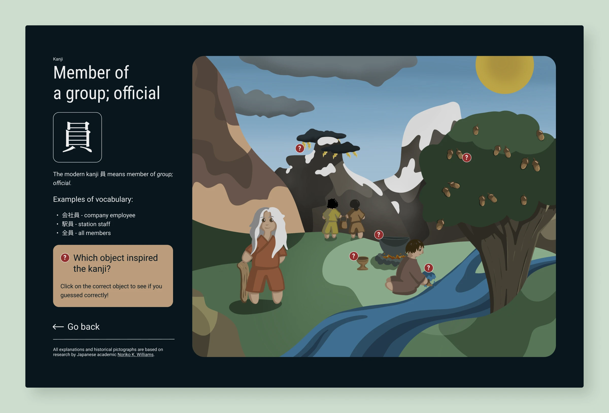
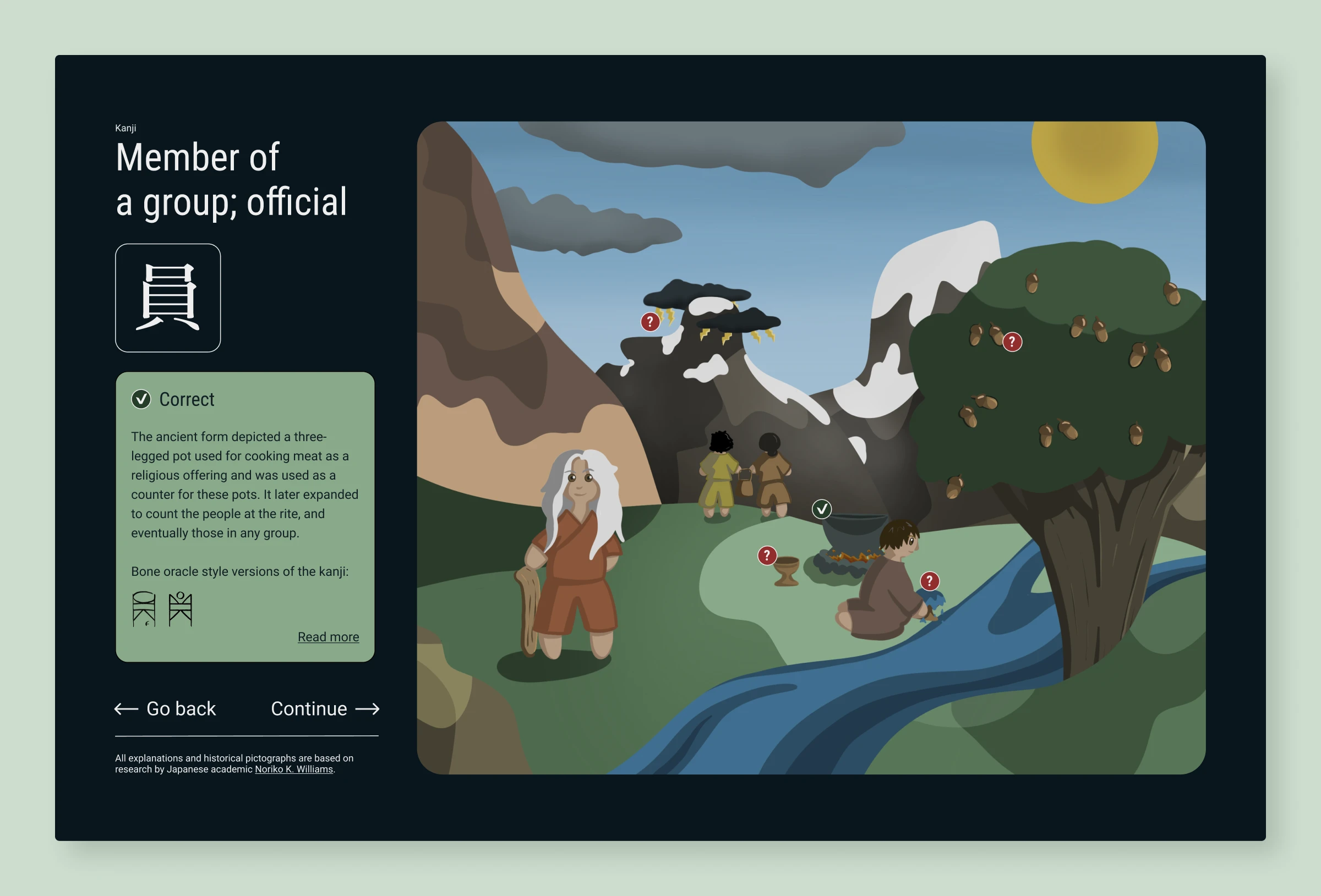
Kanji: Giving flesh to bones
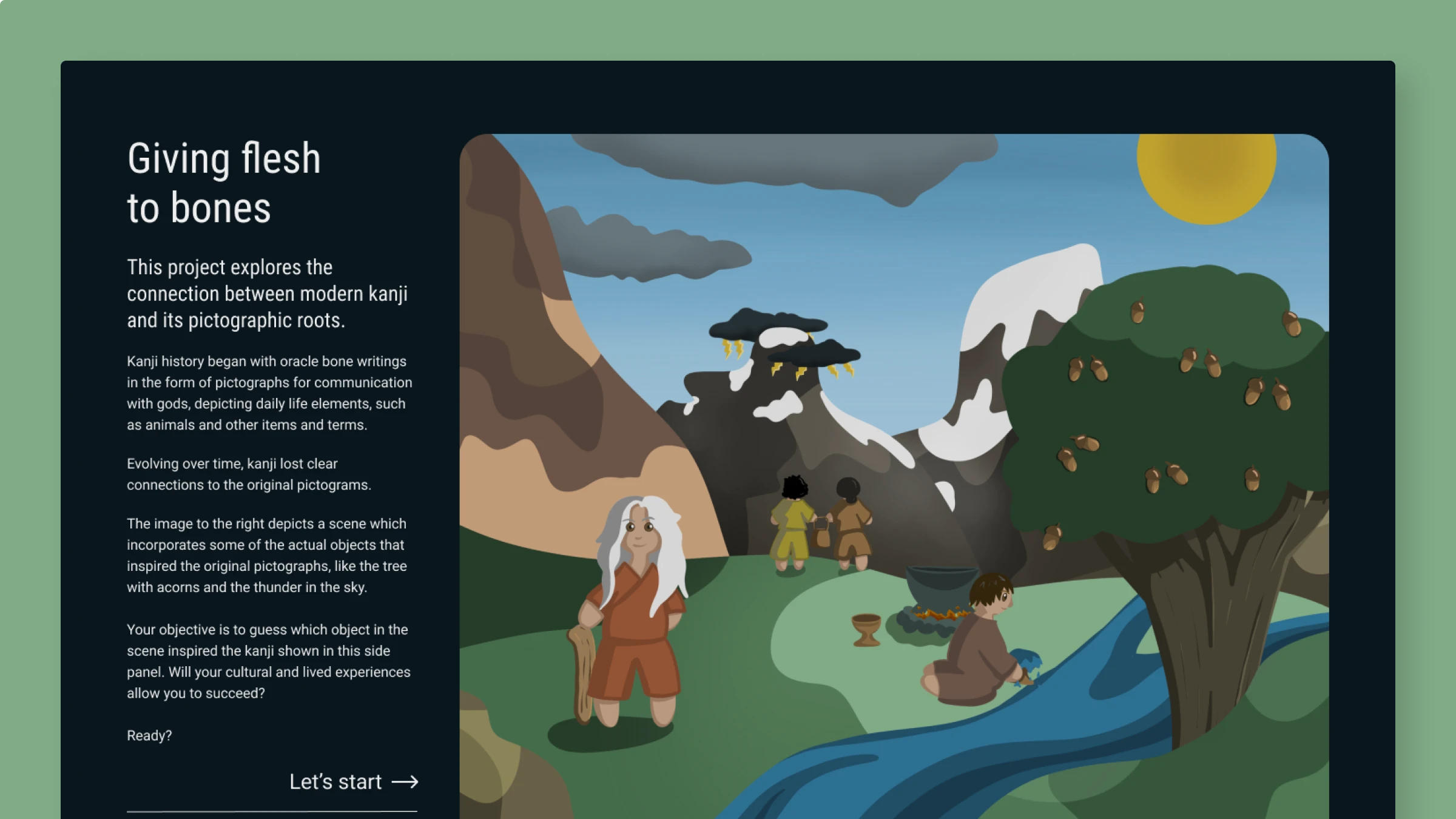
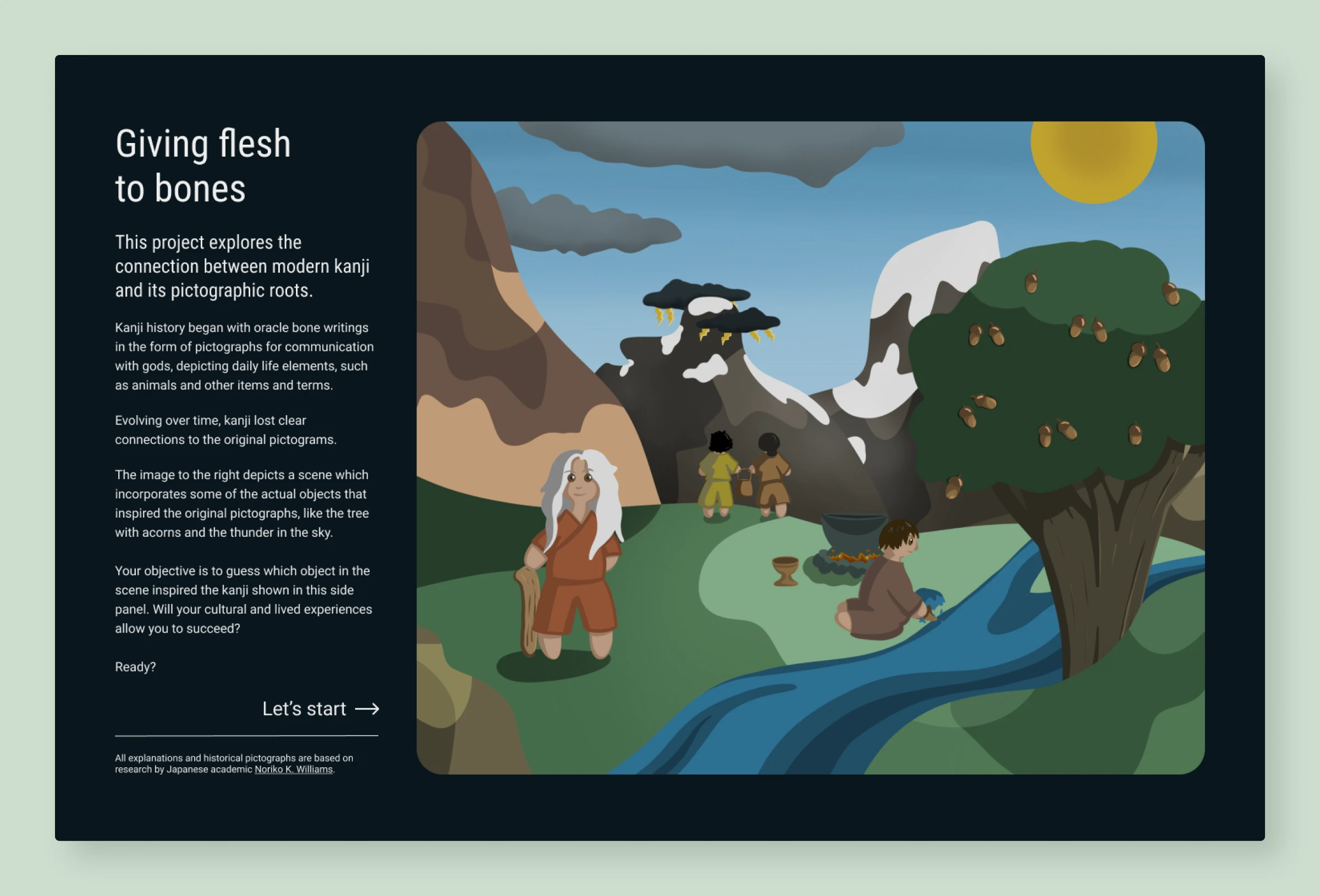
Concept of a gamified website exploring how kanji has changed throughout the centuries. Kanji has evolved from pictures to modern characters. It questions how meaning shifts across time. What matters more—the ancient origins or how people use kanji today?
Project overview
- Assignment brief: Design a critique of an example from graphic design history
- My subject: How kanji changed from pictures to modern symbols
- Role: UX/UI Designer and Concept Developer
- Timeline: 2024
- Type: Course project combining UX/UI and interactive design
- Tools: Figma, Procreate Pro
- Format: Concept screens for an interactive game website
- Research sources: Williams, N. K. (2010), Samara (2023), Ambrose & Harris (2016), Williams (2014, 2010) & Yule (2006) (full reference list at the end of this page)
- Concept evolution: In my initial proposal, I considered making a poster, or a series of such. The idea was to create images focused on exploring kanji and its pictographic roots. As I started to work on the concept, I realized the idea could be more powerful as an interactive experience. A place where users engage in discovering connections between pictures and kanji. That way they become participants in the process rather than just viewers.
The concept
The assignment asked us to choose an example of graphic design history. Then identify its visual traits and propose a design critique. I chose kanji and its history. Kanji have evolved from pictograms (drawings of objects) into ideograms (representations of ideas). In big part stripped of their "flesh" in the process.
My research questioned this loss. Modern kanji are utilitarian and standardized. They lean towards efficient communication. But what if we could reconnect users with their visual history? I created a project focusing on an interactive experience. One where users become active participants in understanding that evolution.
The work serves as a comment on two things:
- The loss of visual connection to the original pictographic form of kanji
- The shift in understanding and interpretation of kanji over time
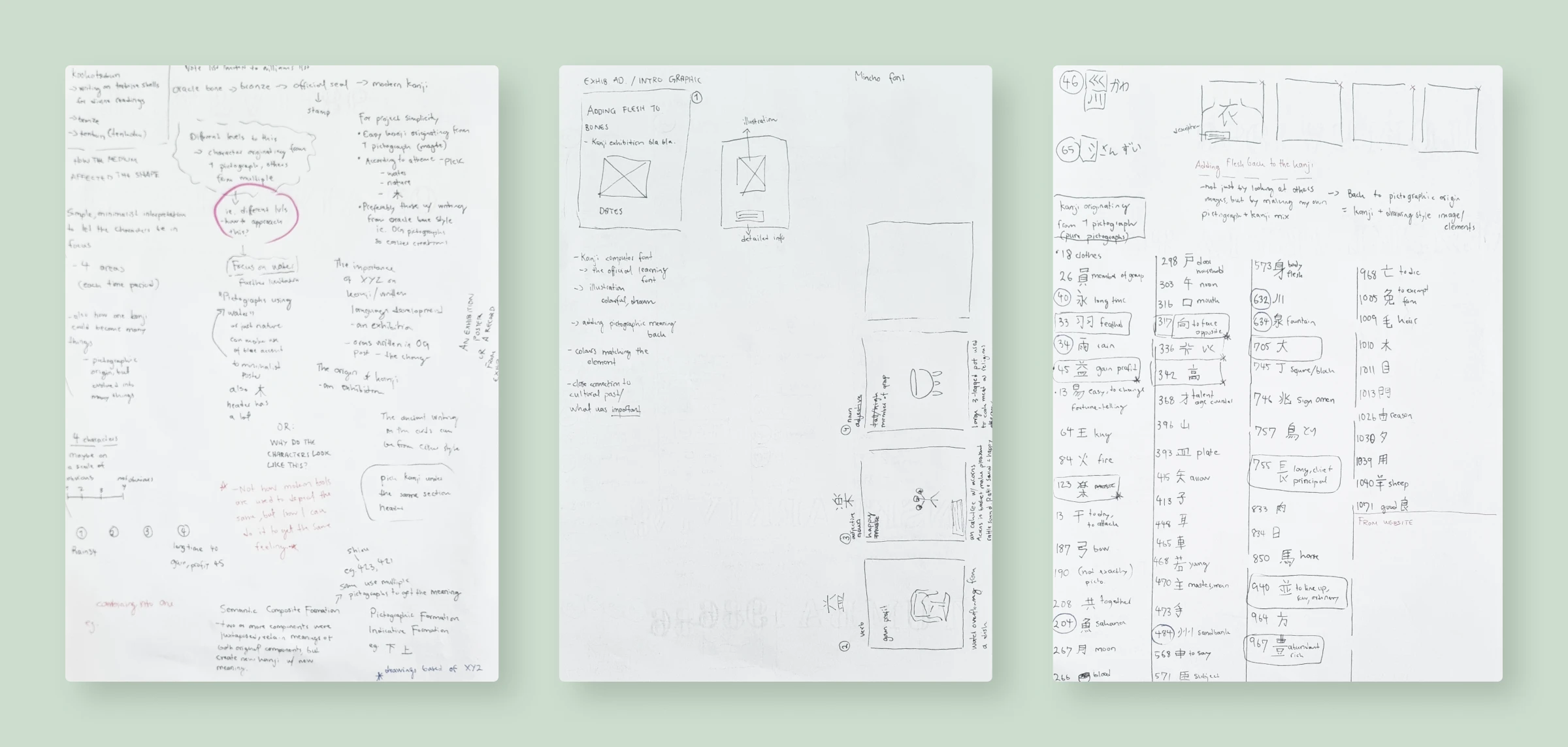
Creative process
The design
What I learned
- Interactive design for user engagement: Focusing on interaction shaped better design. By considering how the users could engage with the content, the work shifted from a static focus to active exploration. It moved from "here's what I think" to "here's what you can discover." This opened up the messaging and learning possibilities for users.
- Everything isn't required at once: I could have added more typical game elements, such as timers and a score board. But the simpler structure already supports the goal. With time constraints in mind, it was better to focus on the core idea and keep additional features for later. These can always be added in the future when there's a clearer understanding of what users need and want.
References
- Ambrose, G. & Harris, P. (2016). The Fundamentals of Typography. AVA Publishing.
- Kanji Portraits: Origins and Radicals of Japanese Kanji — A resource for understanding kanji etymology and historical development
- Samara, T. (2023). Making and Breaking the Grid (3rd ed.). Rockport Publishers.
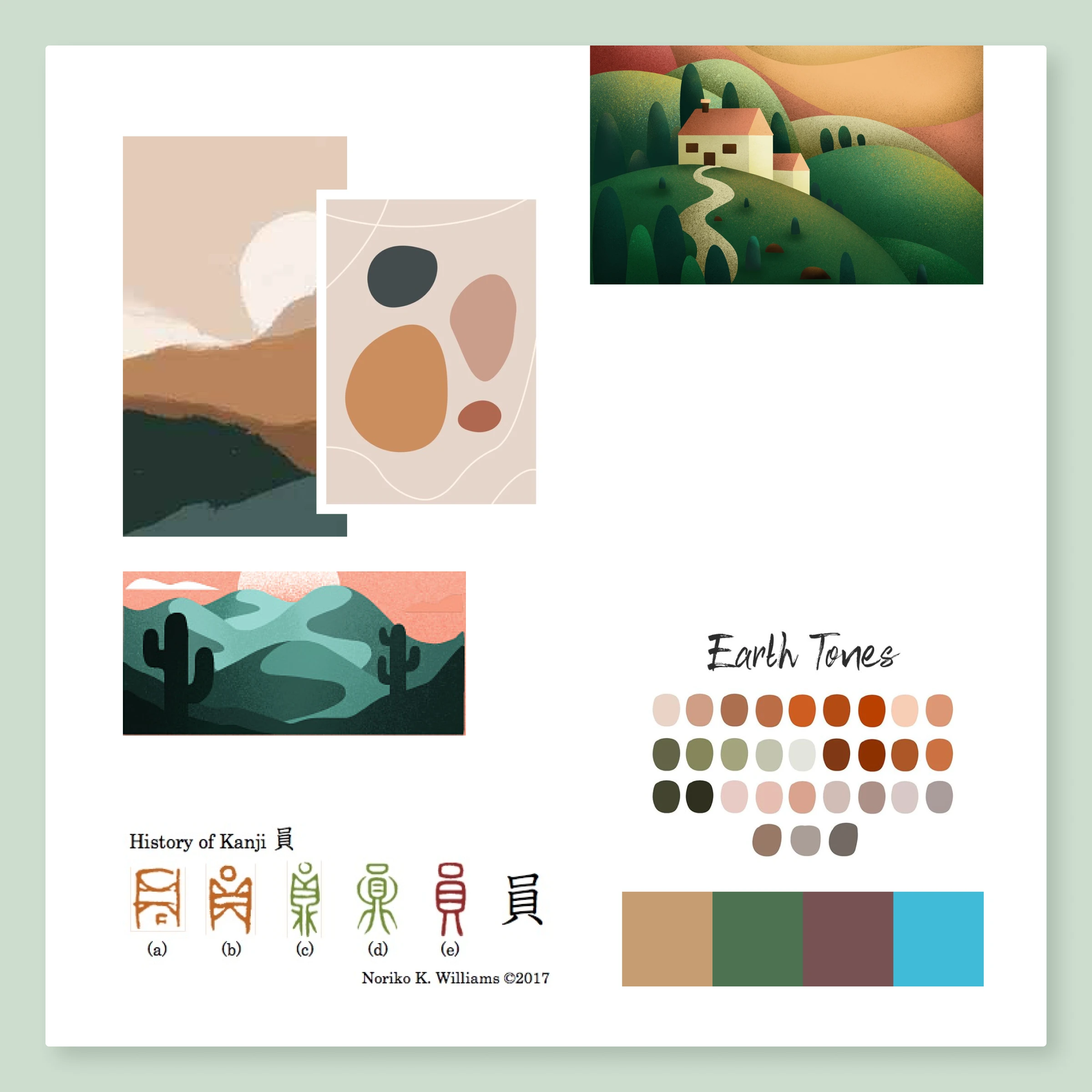
- Williams, N. K. (2010). The Key to Kanji: A Visual History of 1100 Characters (1st ed.). Cheng & Tsui Company, Inc. — The concept of adding "flesh" back to the "bones" of kanji, exploring the relationship between modern kanji and their pictographic origins, is inspired by Williams' work in this book.
- Yule, G. (2006). The Study of Language (3rd ed.). Cambridge University Press.
Other projects
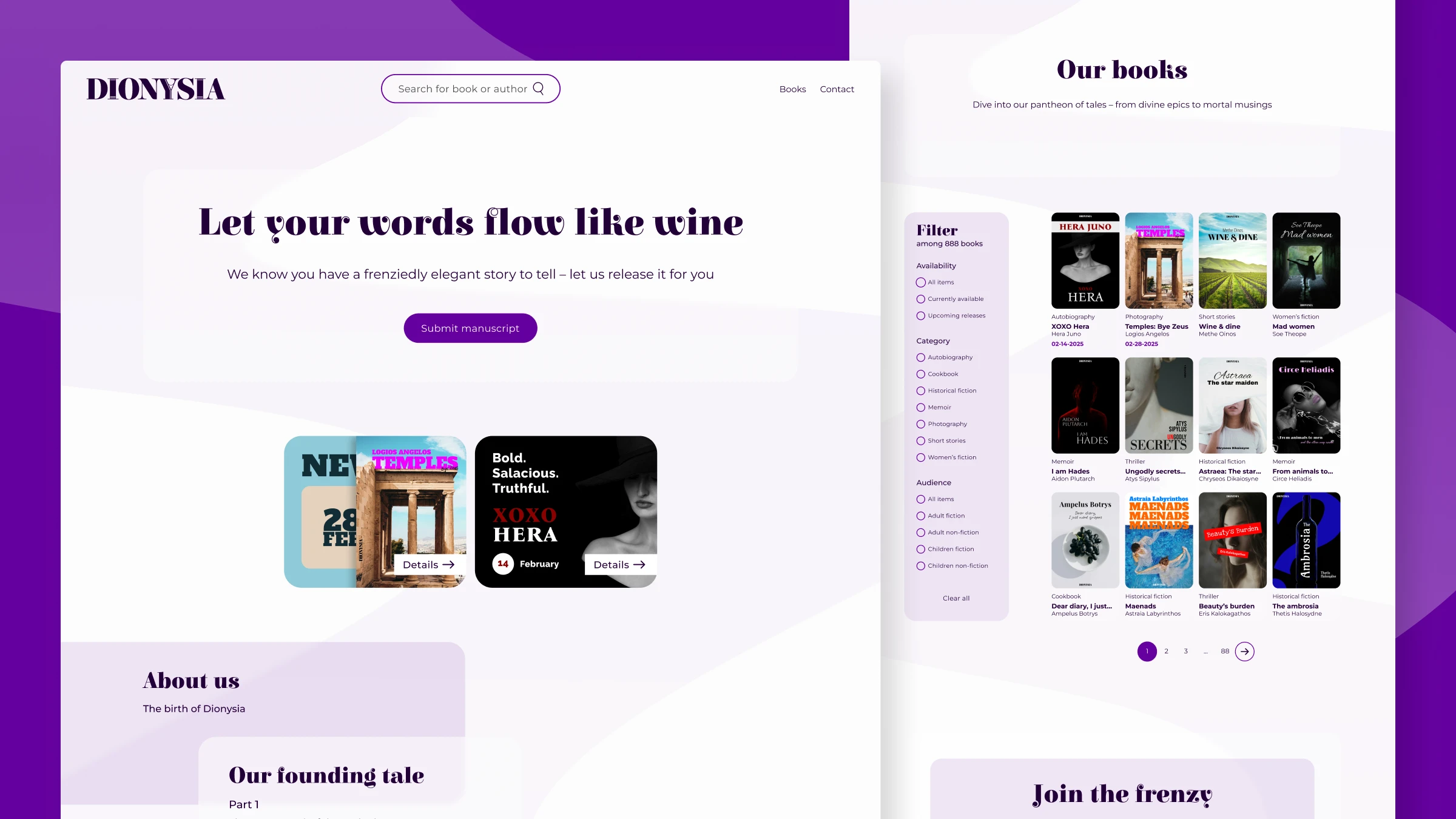
Dionysia: A publisher brand & experience for mythological stories
A course project exploring brand identity and web design for a fictional mythology publisher—balancing strong brand expression with functional design.
View project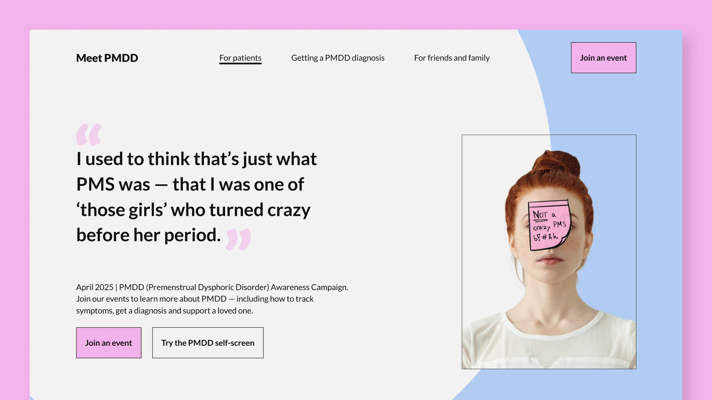
Meet PMDD: A conceptual awareness campaign
A conceptual awareness campaign that normalizes conversations about PMDD through an event landing page, social ads, and a guided journal for symptom tracking and partner dialogue.
View project
The Housekeeper: A typographic reinterpretation
A typographic reinterpretation of The Diary of a Nobody told from the housekeeper's viewpoint, using layout, collage, and print artifacts to create a darker counter-narrative.
View project