A concept brand and website for a publisher of mythology books
Dionysia is a fictional, independent publisher focused on stories relating to Olympus. For this course project, I created a complete brand identity and responsive website. The project explores balancing strong brand expression with functional design.
Project overview
- Project: Dionysia (fictional brand)
- Timeline: Dec 2024 - Jan 2025
- Role: UX/UI Designer, Brand Strategist
- Type: UX/UI, brand identity
- Tools: Figma
- Deliverables: Brand identity, homepage, book catalog, two book campaigns, responsive design
The challenge
This course project let me create a fictional independent publisher from scratch. I was tasked to design a complete brand identity and responsive website. This included a homepage, catalog, and two book campaigns. The publisher's branding, focus, and voice were up to me.
I set myself a creative challenge: Create a distinctive brand that feels accessible to modern readers. How could I create one strong concept that shapes every design choice?
My goal was to create a brand that connects with modern readers, but also holds a rich story and personality in itself.
Developing the concept
I started by asking: what niche could feel both distinctive and work across all design decisions? I wanted something that was both strong enough to shape the brand and give it a clear place in the market.
Why mythology and Dionysus:
A world of storytelling
Greek mythology is full of stories. This provides a rich source of inspiration for a publisher. It also gives the brand a built-in narrative to draw from.
Relatable & human
Dionysus represents joy, wine, theater, and change. This makes mythological stories feel relatable and human, not distant.
Rich visual language
Gods, symbols, and rituals provide recognizable design material to work with.
Built-in design system
Symbols and artifacts connected to Dionysus could become consistent and meaningful brand elements.
Rooting the brand in mythology, and specifically Dionysus, was that it gave me a consistent visual language and narrative framework to build upon. I could then apply it to all design decisions. This constraint worked as a clear guideline to stay on track. This was helpful from a time contraint point of view, as it gave me a clear direction to work with.
Every design decision should connect to Dionysus.
Establishing the publisher Dionysia
Using the mythology of Dionysus, I created the publisher Dionysia. It is a niche publishing house focused on mythology, wine, and celebration. The name comes from the ancient Greek festivals honoring Dionysus.
Learning more about publishers & Dionysus
Competitive analysis
I looked at how publishers present content online. I studied both established houses and independent publishers.
| Publisher type | Examples | Approach | Key insight |
|---|---|---|---|
| Established houses | Norstedts Norstedts: | Focus on books and related events. Publisher brand in the background. Books and events; publisher brand in background. | Focus purely on content presentation. Key insight: Content presentation focus. |
| Independent publishers | Divinamedia, JW förlag, Libraria Divinamedia, JW förlag, Libraria: | Actively use their identity as a differentiator. They communicate their unique position and niche focus. Plus, what unique value they offer authors. Identity as differentiator; unique position and value to authors. | Identity serves as both brand expression and market positioning. Key insight: Identity as brand and market positioning. |
This confirmed my approach: Dionysia is an independent publisher. In line with other such publishers, the brand concept could work as a way to stand out in the market.
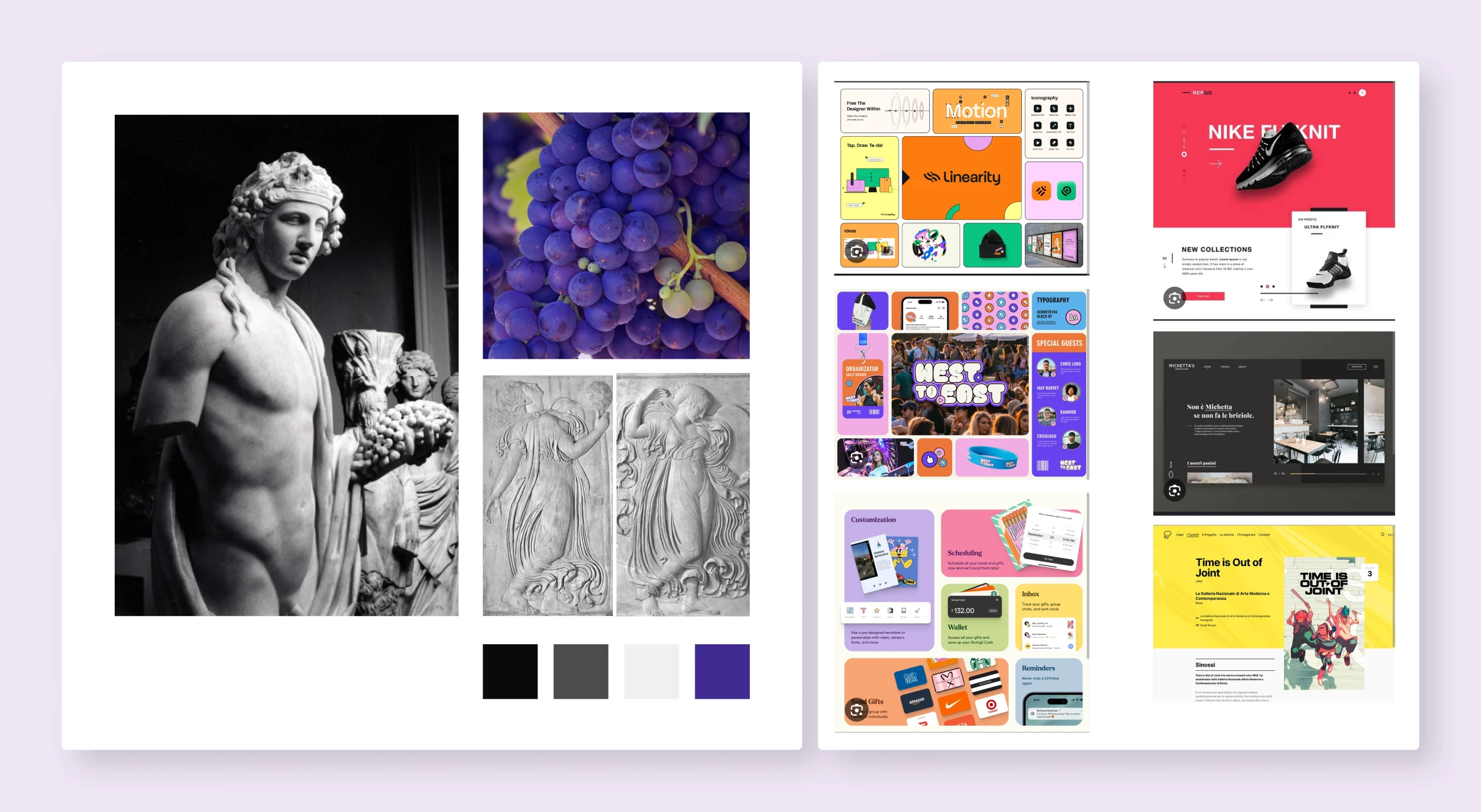
Mythological research
I studied Dionysus through sources such as Britannica and the Acropolis Museum. I did this to understand the character in depth. I focused on recurring symbols and themes:
- Chalice (cup)
- Grapevine
- Purple shades for wine
Design principle: Every visual choice connects to Dionysian mythology. This creates a coherent system instead of random decoration.
Grounding the design in foundational principles
Applying foundational principles
I worked with UX principles from foundational texts to guide my work. This included:
Visual hierarchy (Steve Krug, Don't Make Me Think): I created clear patterns using different heading sizes, emphasis, and whitespace. This helps users find what they need and understand the page layout without delay.
I focused on what users actually need to do first. The mythology-related elements would build on this, not get in the way of usability.
Simplicity (Giles Colborne, Simple and Usable): I focused on what users actually need to do first. Mythology came second. I used it as a constant theme, but not overwhelming. Every page has a clear purpose. The tricky part was figuring out when mythology made things better and when it got in the way.
Conventions over novelty: I looked at other publisher websites to see what patterns work. This included navigation, book displays and submission forms. I aimed to follow conventions for navigation, showcasing books and structuring submissions forms. This allowed me to create a site that felt familiar and easy to use, while still expressing the unique brand identity.
Designing the logo
Dionysus' symbol is a chalice. I used this for the logo because it connects to the god. It also echoes the phrase "the drop that overflowed the glass". Here, it brings the mind to the last drop that made the chalice overflow and spill out a story. It could be Hera's tell-all autobiography. Or a book about temples, critizicing Zeus.
In short, it brings the imagination to an overflowing chalice pouring out stories. This felt like a strong visual metaphor for a publisher.
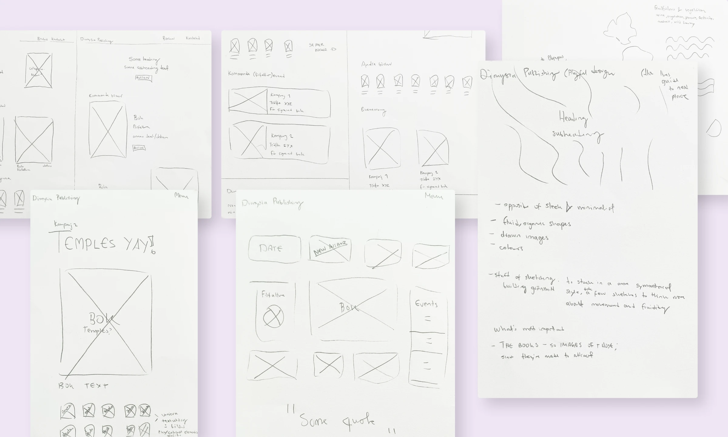
Wireframes: Starting with structure
Sketching layouts on paper let me explore different structural options. I tried different patterns to get an understanding of my options. This was a helpful way to separate structure from visual design. I could focus on how to organize content and create a clear hierarchy without getting distracted by colors, typography, or imagery.
This separation made design decisions much clearer. I first worked on structure, and then separately on organic elements. Following this process, I considered how to bring them together. The goal was usability first, with fluid forms for brand enhancement.
The solution
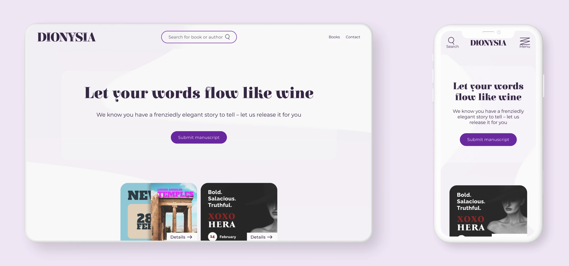
Brand identity
Logo: A stylized chalice with wine. This connects to Dionysus while staying clean and modern.
Color palette: Purple (wine), cream (parchment, ancient texts), and dark charcoal for readability.
Typography: Elsie, an organic serif for headings. It feels dynamic and exciting. Montserrat, a clean sans-serif for body text. It grounds the design in modernity and balances Elsie's bold personality. Book titles, body and other text is also kept clear for readability.
Voice: Celebratory, bold, literary. The tagline "Let your words flow like wine" captures the spirit of Dionysus. It leans into creative freedom balanced with craft.
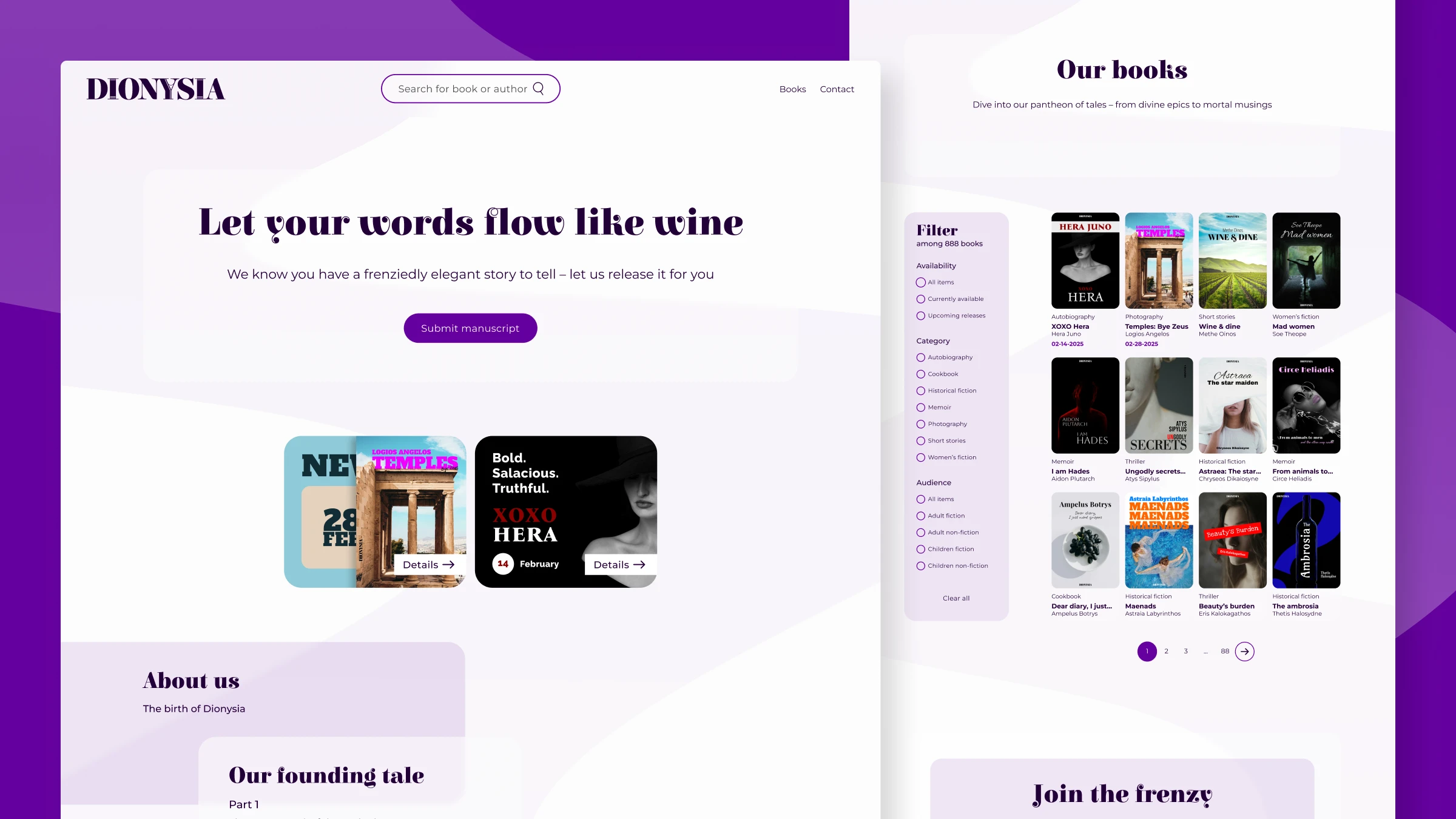
Homepage
The homepage does the following:
- Establishes the brand identity and voice
- Communicates the publisher's unique value proposition
- Provides clear paths to key actions and content
Key decisions
- Hero section: Impactful opening with the tagline layered over flowing wine visuals. This creates a strong first impression and sets the tone for the brand.
- Primary actions visible: "Books" and "Submit manuscript" are easy to find. This supports both user needs and business goals.
- Founding story: The "birth of Dionysia" tells the story of the publishing company. This provides context for the company identity and publishing focus. It also gives the brand a narrative to build on in future campaigns and content.
- Visual hierarchy: I balanced brand expression with clear structure. I used whitespace and layering to separate functional content from mythological elements. This way users can focus without feeling overwhelmed.
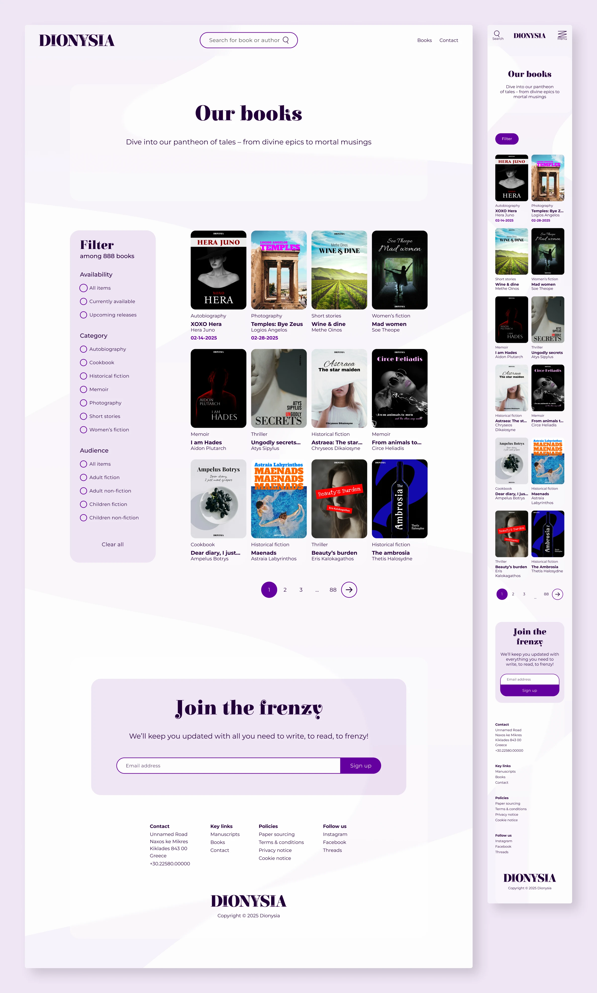
Book catalog
The catalog is easy to browse and visually highlights the books. It also incorporates subtle mythological touches to reinforce the brand without overwhelming the user experience.
Key decisions
- Grid layout: Clean, easy-to-scan book grid.
- Book covers as heroes: The books speaks for themselves. There's minimal decoration around the actual cover images.
- Clear categorization: Genre tags and filters make it easy to find relevant books without needing to understand the mythology. This supports usability for a wide audience, including those who may not be familiar with the mythological themes.
- Mythological touches reserved for accents: Purple highlights and mythology-connected text, but nothing overwhelming.
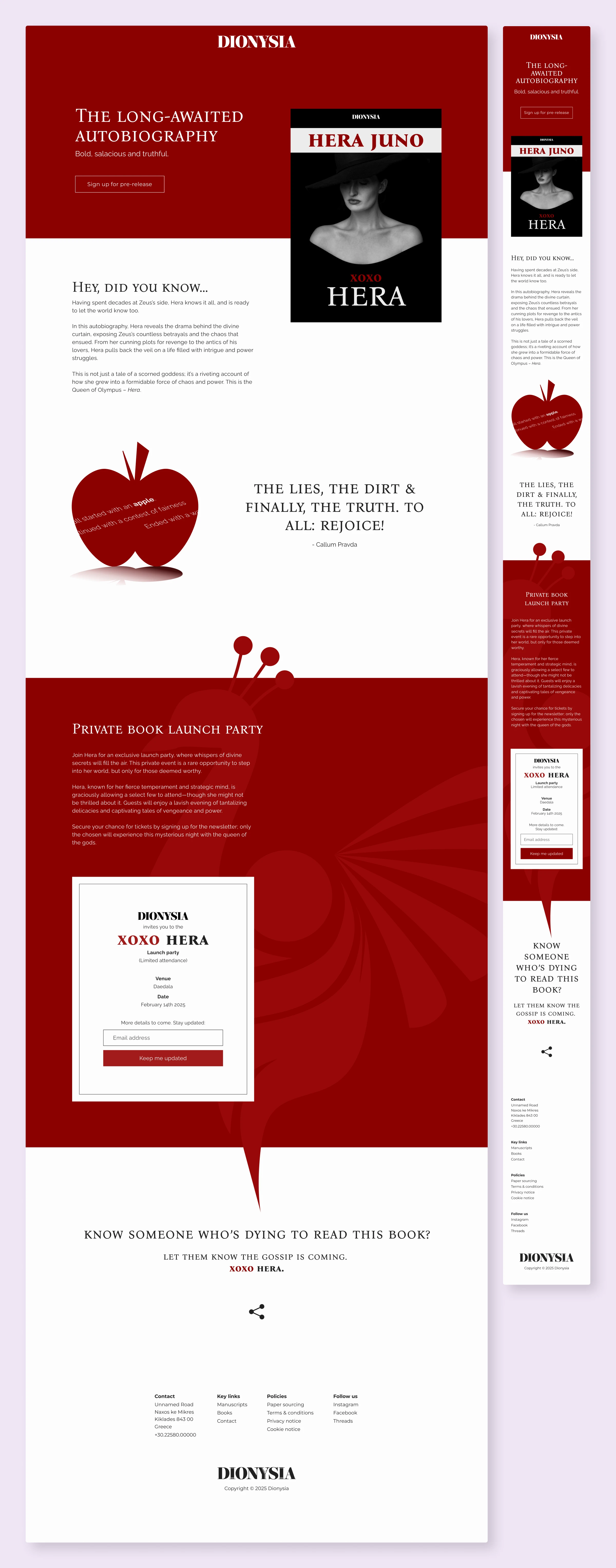
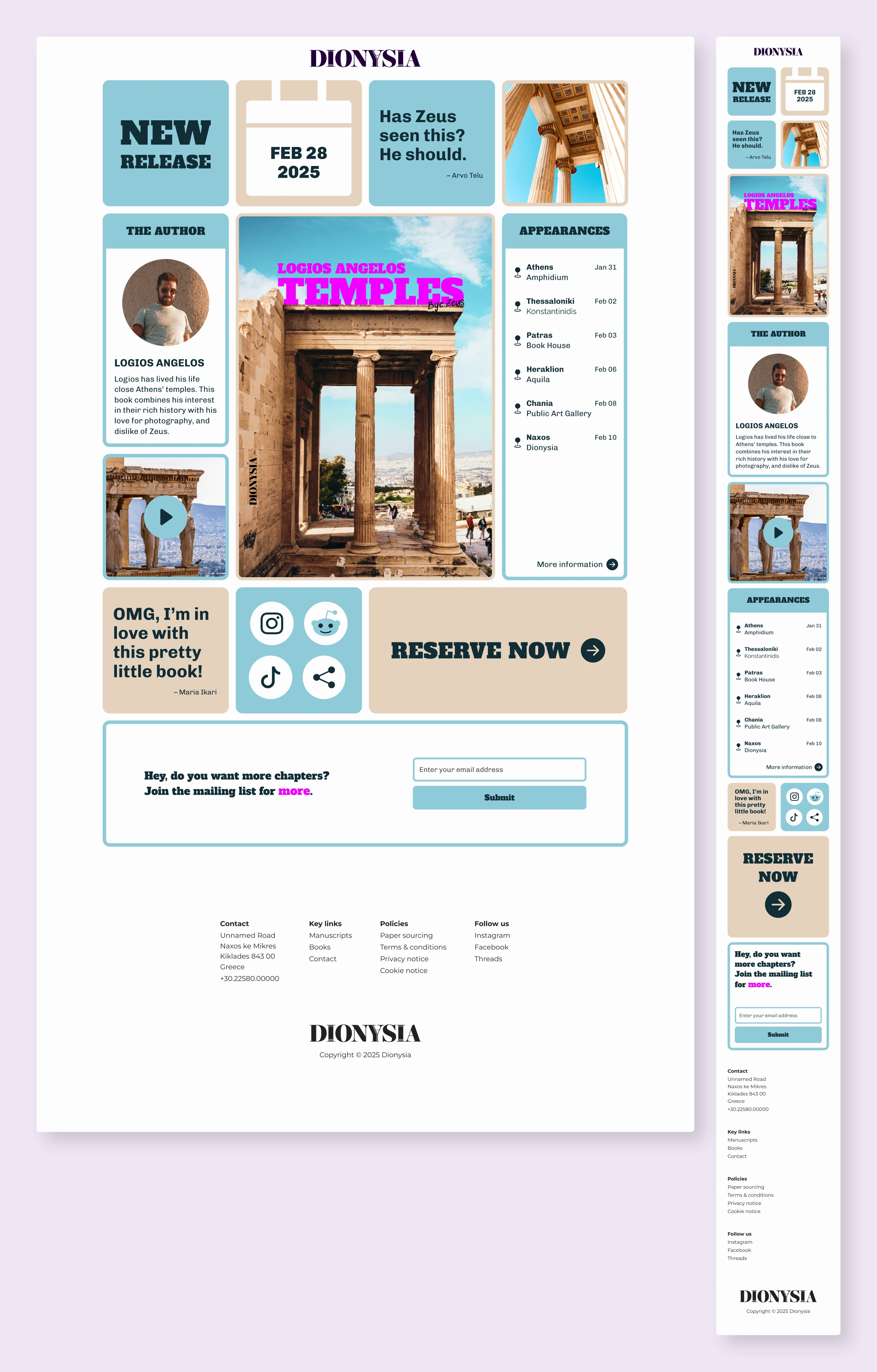
Book campaigns
For the book campaigns, I let the featured books inform the design. Rather than forcing a Dionysus-connected design, I used the themes and aesthetics of the books to guide the visual direction. This way, the campaigns felt unique and relevant to the specific content being promoted.
- Campaign 1: A sleek look with a bold, red accent reflecting the featured book's themes—love, anger, and jealousy. The red symbolises this. The typography conveys power and elegance to match the content's tone.
- Campaign 2: A layout using blocks and frames that look like photo spreads. Colors come from the featured book's cover. The typography reflects the book's tone and carries the image of the stone pillars used for temple-building.
Contact page
The contact page keeps the brand's mythological identity while making it easy to get in touch.
Key decisions
- Accessibility focus: The design prioritizes usability and clear information hierarchy. This ensures that users can easily understand how to get in touch and what information is needed, without being distracted by decorative elements. Form design that prioritizes usability and clear information hierarchy.
- Mythological context: Subtle design elements that reference Dionysian themes without getting in the way.
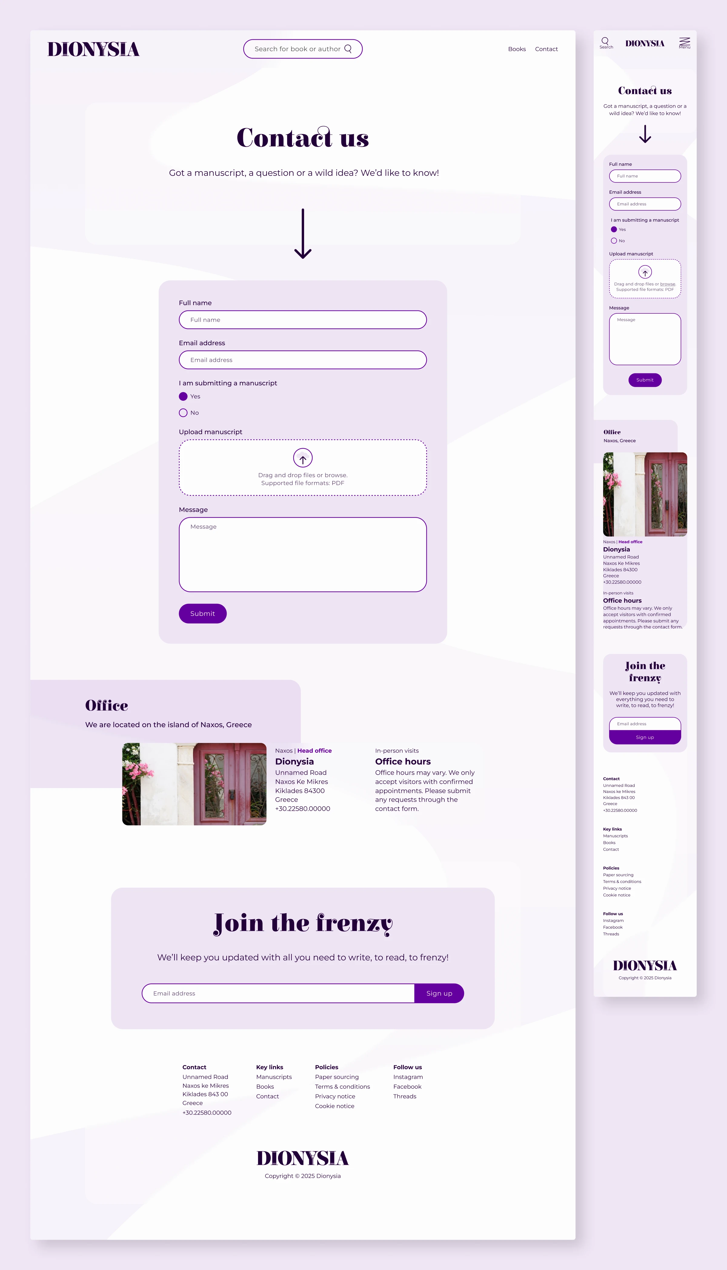
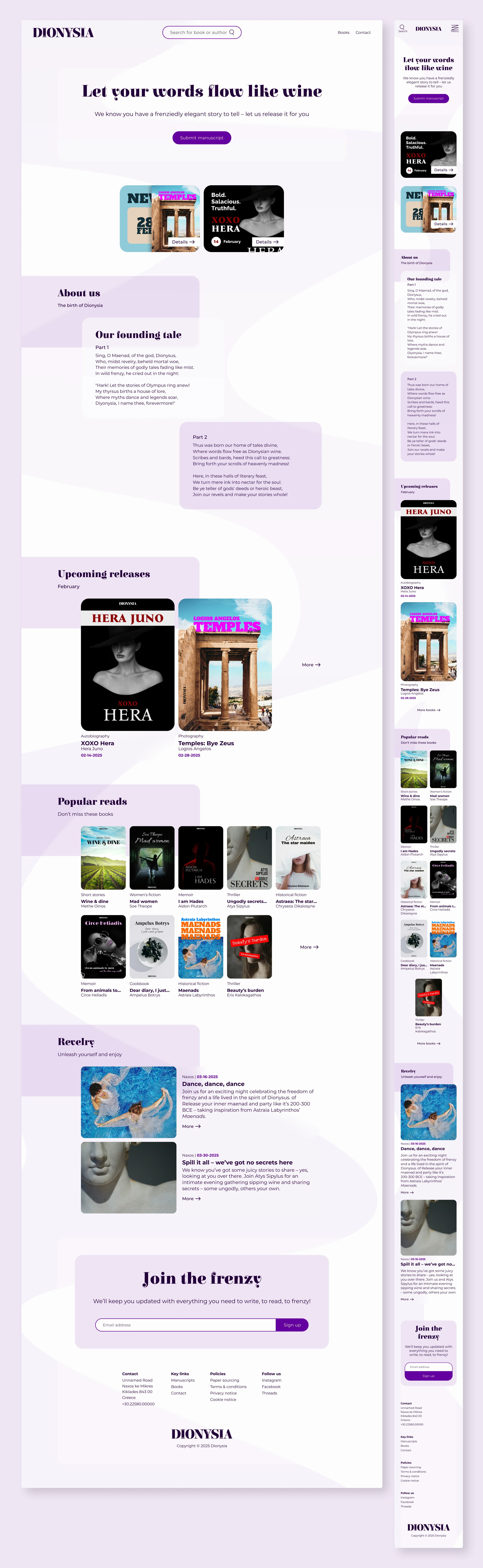
Responsive design
The design adjusts according to screen size while staying consistent.
- Mobile: Simplified navigation and stacked layouts.
- Desktop: Full horizontal space used.
What I learned
- Choosing your own constraints can be a challenge: I knew from the beginning that the constraints would need to be narrow enough to guide me, but not so narrow that they would limit creativity. At first I considered a broader theme of "mythology" or "ancient stories". But this felt too broad and unfocused. Choosing Dionysus as a specific anchor gave me a clear direction to explore. It also made the project more fun and engaging. It was a good way to keep myself focused and needing to justify my choices sharpened the decision-making process.
- Balancing brand expression with usability requires choosing what to keep and what to cut: Originally, I wanted to include more mythological elements and symbols. But I realized that this would not be possible, as it would overwhelm both the desig and the user. I had to make intentional choices about what to include and what to leave out. This further reinforced the importance of asking why something is in the design. Why is it important? Does it add to the user experience? Does it connect to the brand identity in a meaningful way? This process of cutting down to the essentials was a valuable exercise in prioritization and clarity. It helped me focus on what really matters and create a design that is both expressive and usable.
- Sketching on paper is a great way to focus on structure: The analogous part of the process helped me focus on the structure and try design options. I could quickly sketch these and then move on if they didn't work. This helped me explore alternatives and was useful when considering choices.
References
- Acropolis Museum. (n.d.). Thematic section: Sanctuary and the theatre of Dionysus. https://www.theacropolismuseum.gr/en/sanctuaries/sanctuary-and-theatre-dionysos
- Britannica, T. Editors of Encyclopaedia (2024). Dionysus. Encyclopaedia Britannica. https://www.britannica.com/topic/Dionysus
- Colborne, G. (2011). Simple and usable: web, mobile, and interaction design. Berkeley, Calif.: New Riders.
- Krug, S. (2014). Don't make me think, revisited: a common sense approach to web usability. 3rd ed. Berkeley, Calif.: New Riders.
Other projects
Meet PMDD: A conceptual awareness campaign
A conceptual awareness campaign for conversations about PMDD. It includes a landing page and social ads as digital elements. There is also an analogue journal for symptom tracking and partner dialogue.
View project
Kanji: Giving flesh to bones
A matching game that shows learners how modern kanji connect to their original picture forms. The purpose is to learn the story of each character.
View project
The Housekeeper: A typographic reinterpretation
A typographic reinterpretation of The Diary of a Nobody told from the housekeeper's perspective. It uses fictional copy, layout and imagery to create a darker counter-narrative.
View project